This makeover feels almost bittersweet to share as it unexpectedly turned into our final makeover in this home! When we first set out to update the remainder of our foyer this past Fall, we had no intention of moving. But if you follow me on Instagram, you will know that we recently announced that we decided it was time to sell our home and go on a family adventure down south. More on that later.
So this truly will be the last makeover I share with you guys from this home, although I will have a few more posts coming up about the home before we move, so stay tuned for those.
If you can remember back to December 2019, we shared a three-part series on how to update an older home, focusing mainly on our lower foyer. We shared how we updated our basic builder-grade doors to the gorgeous Fashion Forward doors that so many people still love to talk about. Next we shared how we updated all the hardware to the brass Schlage door handles – absolute show stoppers! Finally, we shared how we decided to paint our wood staircase for the most dramatic before & after using Valspar paint!
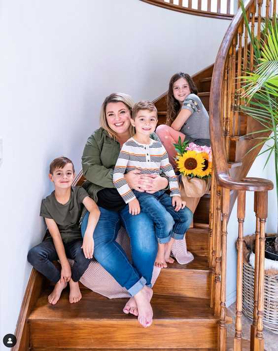
Here’s a reminder of what the foyer looked like when we first started. You’ll also notice that we changed the flooring when we did the kitchen makeover – I talk about them in this post!
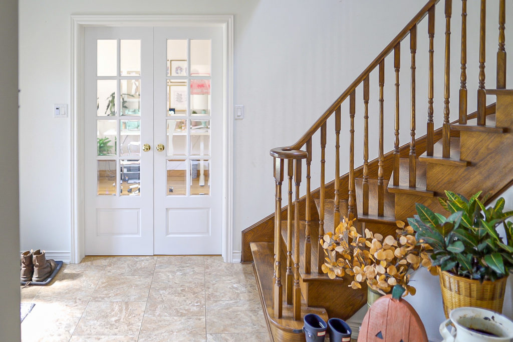
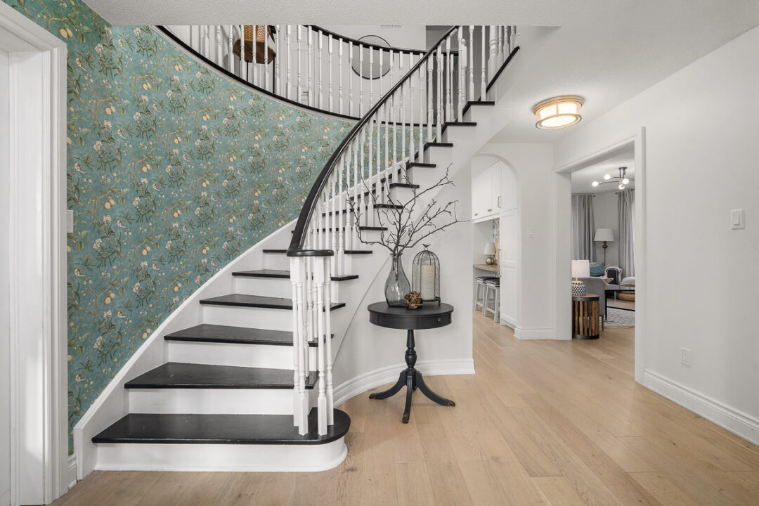
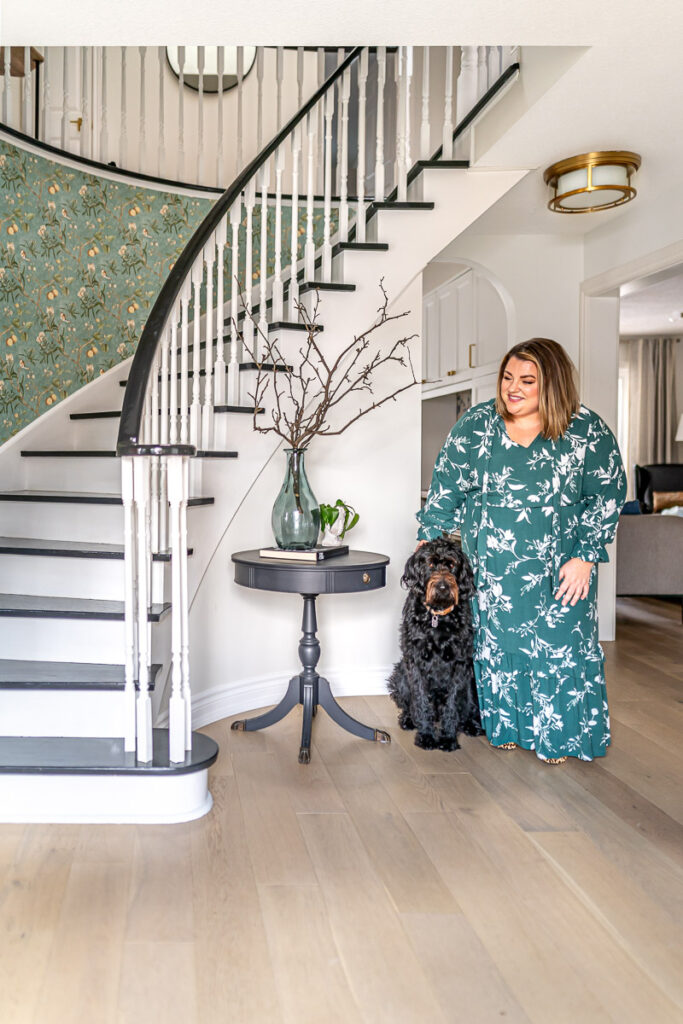
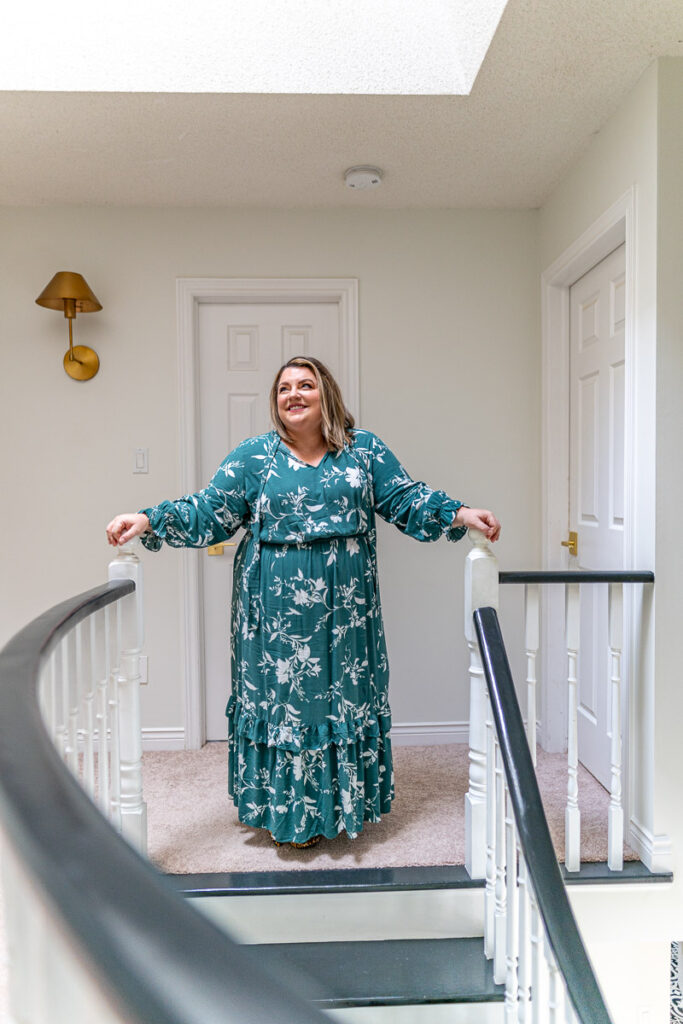
While we did a lot of work in that series to update the foyer, there were still some things we never got around to, including the ceiling lights. But we also had never tackled the upstairs foyer to match the downstairs and so this past Fall, we decided it was time to finish the project and make our whole foyer area – upper and lower – feel cohesive and pack a little punch in terms of design aesthetic!
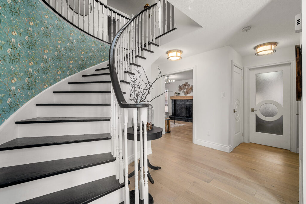
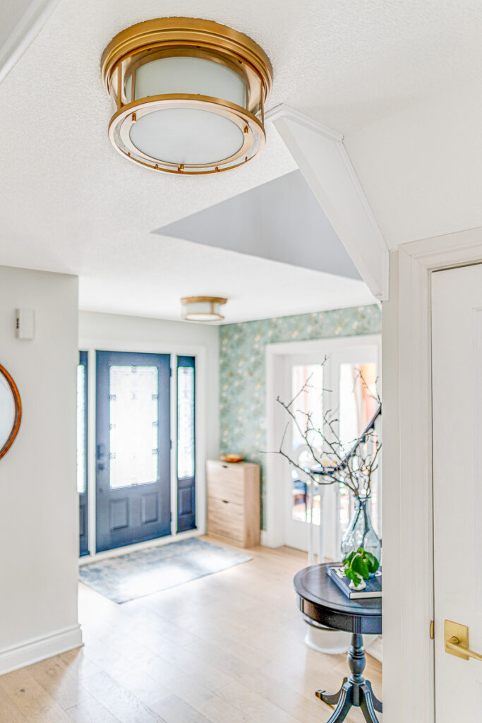
Starting with the lights, we have three flushmount light fixtures in the lower foyer all within close proximity to each other. So it always bothered me that they didn’t match! I reached out to my friends at Z-Lite to see what they had because as you know, we’ve fallen in love with their lights after we put them all throughout our kitchen renovation back in 2020.
As soon as I saw the Willow Olde Brass flushmount lights, I knew those would be the perfect fit for the foyer. When I’m asked to describe my home aesthetic, I’ve always said that it is a modern French design with a touch of flare! There are certain rooms that have a mind of their own (ahem, my office) but for the most part, I’ve really tried to stick to a French design but always with a more modern take on it. So when I saw this flushmount light, I felt like it embodied both that classic French feel but with a more modern look to it.
They make SUCH a statement when you first walk in the home – even our realtor when she came over said “Oh wow! Where are these lights from?! I HAVE to have them!” That says a lot coming from someone who sees A LOT of lights in various homes!
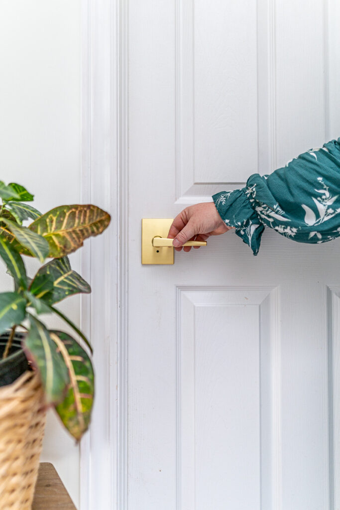
Next up was the hardware for the upstairs foyer and we knew exactly what we wanted – the custom Eller Lever with Century Trim in brass, just the like the lower foyer! We absolutely LOVE how these have looked in the lower foyer and again, it’s something that people comment on every time we have guests over.
I’ve mentioned this before on the blog, but I think one of the most overlooked areas in design is hardware. It’s quite honestly something I never really focused on much before I really got into interior design. I figured if it looked modern/new enough, it was fine. But once you start discovering more hardware and playing around with it in your designs, you realize just how significant it really is. It might be a small physical part of a room, but when it’s done right, it can sure have incredible impact. This goes for not only the visual aesthetic of the hardware, but also the touch and feel. The minute you go to pull or turn a knob or lever, you will immediately be able to tell if it’s high quality or not. That was something I noticed right away with the Schlage levers – they have a really good feel to them and you know instantly that they are high quality when you use them.
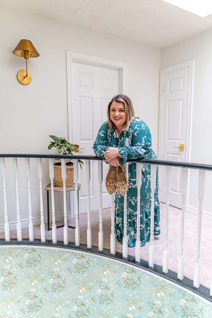
The next design piece was our paint. This was a very long topic of debate for us as we just weren’t sure what was going to be the perfect colour to tie the lower and upstairs foyer together. We also had to consider the wallpaper – more on that in a minute.
As you can probably tell, I LOVE colour and lots of it! That’s one of my favourite things when I look around this home that makes me so happy – that I wasn’t afraid to experiment with colour! So when it came to the foyer, I had actually originally thought we would do something in the blue family. Because we do have a lot of blues in our home, I thought a somewhat neutral and lighter blue might have been the perfect tie in. But the more I considered it, the more I kept leaning towards a lighter, more neutral colour.
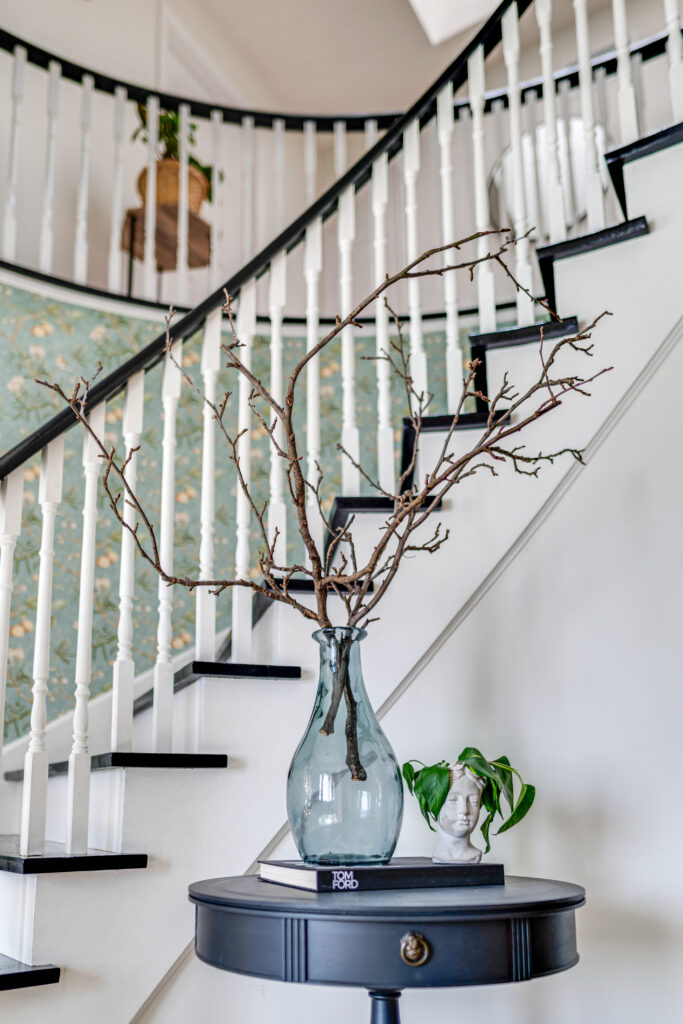
In the end, we landed on Hailstorm Gray from Valspar. Valspar Canada has been the paint of choice for this home and we’ve always been so pleased with not only the quality of the paint but also the colour selection. If you can remember our office makeover, it was all Valspar paints that I used to paint that custom mural wall! I just love how those colours all worked so well together!
But back to Hailstorm Gray – it’s funny because I know it’s technically a gray colour, but to me, I see it more as a cream with a lot of warmth. I thought it was the perfect soft, neutral to keep the walls in the foyer clean and give it more of an open feeling but still have that sense of old world charm to it that tied in with the rest of the home.
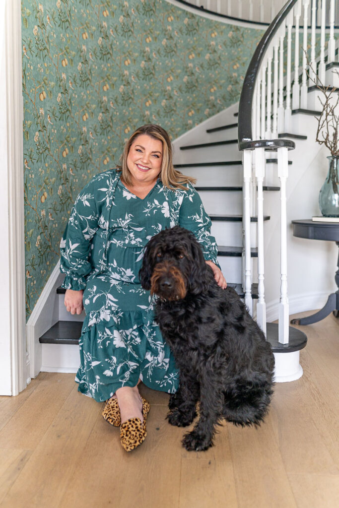
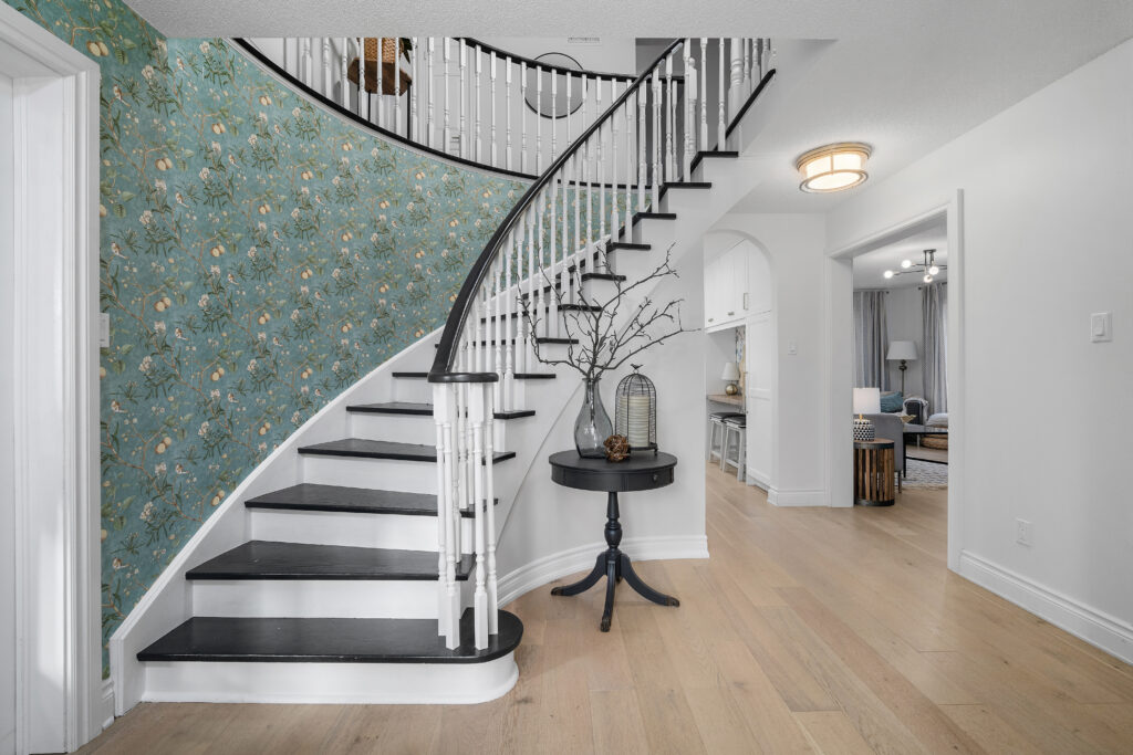
I also felt like it tied in perfectly with the wallpaper! Now this wallpaper was actually the reason this project was so delayed. We had tried getting another wallpaper (if you remember I did a poll on my Instagram back in the Fall between two patterns) but there was delay after delay. Then when it finally did show up, there was a major misprint in the colour and it was not at all what we thought it was going to look like. So we had to scramble and try to find something that worked with all of these elements that we had already selected for the foyer.
The wallpaper that I ended up choosing from this beautiful vintage flower, apple and bird wallpaper from Amazon. The colour is listed as blue but I’d say it has more of a blue-ish green hue with lots of creams and gold tones. It’s absolutely beautiful and I think makes such a statement the minute you walk into the home. I feel like it also ties into not only the French vibe that we have, but the colours work with the office colours that you also see as you enter the home.
The reason I wanted wallpaper on that wall was because if you look back to the pictures of when we first did the stair makeover, I always felt like that curved wall was quite bare. I had considered hanging pictures on the wall, but because it was a shorter wall, I felt like the kids would constantly be knocking them down as they ran up the stairs. So wallpaper felt like it was a great option to add a big statement without having to worry about anything getting broken!
The final thing that I wanted to mention here because I just know I’m going to be asked why we didn’t change them are the upstairs doors. As you know, we swapped out all the lower foyer doors to the gorgeous fashion forward Metrie doors and when I say they are the MOST talked about item in our home, I’m not lying! Even last night when our neighbour came to buy a few pieces of furniture from us, he asked “Can I take these doors too?!”
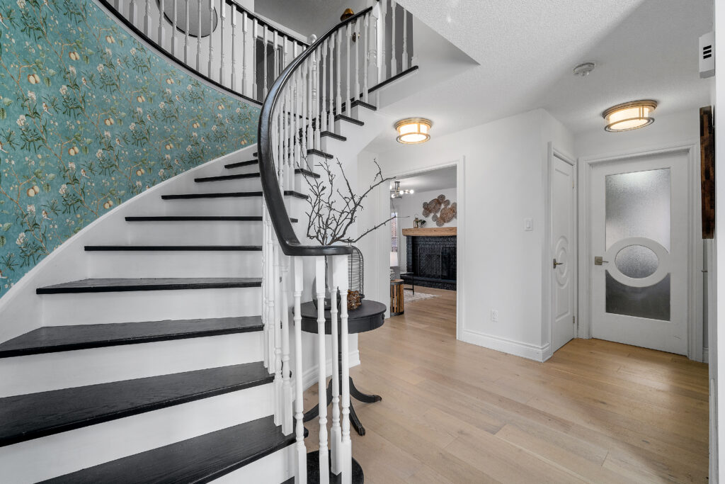
To my dismay, I discovered this past Fall that Metrie had actually stopped making the fashion forward doors! I quite literally gasped when I received the news as I just couldn’t understand why a door as gorgeous as these would be discontinued. I still don’t know the full reasons why, but I have tried to convince Metrie a number of times to reconsider that decision! When I think of French design, I immediately think of show-stopping, very detailed doors and if you’ve ever been to France, you will know that many of their incredible doors include circles on them! So to me, these doors are the epitome of French design and I would have LOVED to put them in our upstairs foyer to have them all match. But alas, it wasn’t meant to be this time around so for now! Still holding out hope that one day Metrie will bring them back and perhaps the new owners can complete that upstairs foyer with them!
Well friends, there you have it – our FINAL home makeover for THIS house! It’s hard to believe all that’s been accomplished here in only three and a half years. I’ll save my sentiments for another post where we can take a trip down memory lane, but for now, I’m just so happy with how the foyer makeover came together!
I want to thank our amazing sponsors Schlage, Valspar Canada and Z-Lite. All three of them have been long-term partners that I value dearly and it’s been such a pleasure getting to work with them and feature their incredible products in our home! I hope you love them all just as much as I do and make sure to check out their wonderful selections next time you are updating your home!
Thank you again for allowing me to share this home design journey with you! It is bittersweet that it’s coming to an end, but as the old adage goes “When one door closes, another opens” – there WILL be another home to design in the near future of that I am confident!
So stay tuned, my friends!
Love & Blessings,
Christine
Note: This post was sponsored by Z-Lite, Valspar Canada and Schlage where I have received product and/or compensation in exchange for my honest reviews.

