Hello friends! It’s been a minute since we last hung out here on the blog and I’m so glad we are reuniting here just as it should be!
If you’ve been following along on my Instagram, you know that we’ve been slowly diving into some home decor projects for 2020. I made a HUGE list of all the things I’d love to get done this year around the home and let me tell you – it’s HUGE! However, with the exception of 1-2 spaces, most of the projects are smaller, bite-sized renovations. Room refreshes is probably a better way to word it! We want to share them all with you and hopefully inspire you guys along the way that no matter what budget or skill level, that you too can make changes in your home that help reflect who you are and create a more personal space. So make sure you follow along as we gear up to share a lot more with you in 2020 from our home to yours!
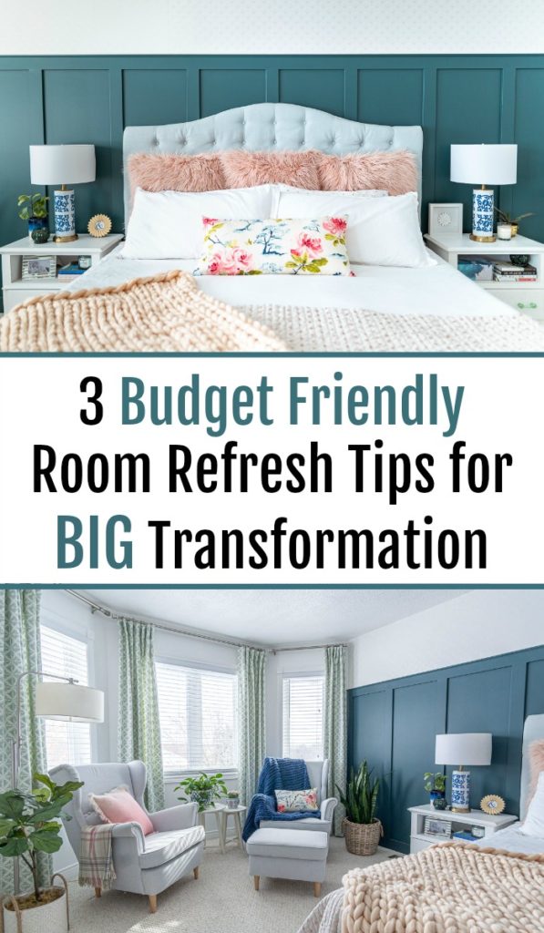
To kick this off, we tackled our master bedroom this week, with the help of Valspar paint! Since we moved in a year and a half ago, I’ve been going slowly, room by room, and completely renovating them top to bottom. While there’s nothing wrong with that, the flip side of it means that most rooms have NOTHING done to them. I’m talking no pictures hanging on the wall, NOTHING! And for someone like me who is very visually inspired, that can leave me feeling frustrated and uninspired in those spaces.
Case in point – our master bedroom. If you remember from our old home, we renovated our master during our second time participating in the One Room Challenge. It was SO dreamy! Every time I walked into that space, including when I woke up in the mornings, I just felt relaxed. It was my happy place.
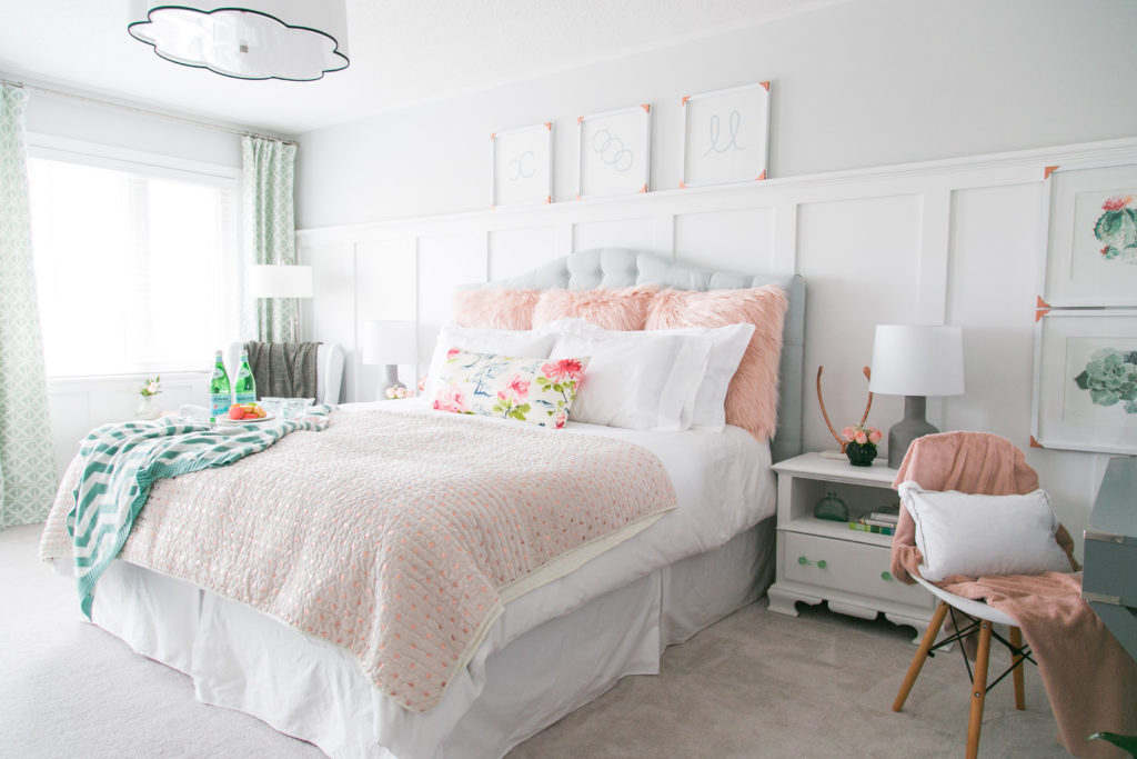
Then when we moved, we simply set up the furniture in place and called it a day.
Needless to say, it’s been driving me NUTS for almost the entire time we’ve lived in this home! I wake up in the morning and stare at the ugly, off white walls, the oversized (and off centered), dark brown ceiling fan and I’m completely uninspired to start my day. I know that might sound trivial to some – I’m not saying I need material things to motivate me – but as a designer I absolutely need my living space to speak to me. And the way this room has spoken to me this last year is “BLAH BLAH BLAHHHHHHHHH!”

So – it was time for a change!
But I still loved the design from our previous home, including all our bedding and furniture, etc. We didn’t want to spend a bunch of money either on buying all new things when it wasn’t necessary. Also, as a designer, I think I’m not alone when I say that recreating the EXACT same space TWICE isn’t really inspiring.
So the plan was to keep the same key players – the headboard, side tables, chairs and even bedding – and simply add some texture and depth to the wall, colour to the room and swap out a few accessories, to bring this space to life! And that’s EXACTLY what we did!
Ladies and Gentleman, I present to you, our master bedroom refresh!
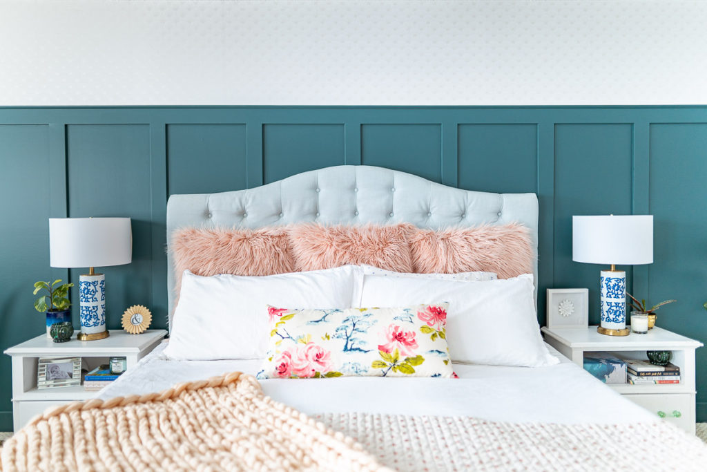


Big difference, eh?!
Here’s the crazy thing – we actually only changed THREE things: 1) Added texture to the wall with board and batten and wallpaper, 2) Painted and 3) Swapped out a few accessories. We didn’t change any furniture nor bedding. We didn’t even change the pillows! The only thing that I bought for this refresh were the GORGEOUS lamps! I lucked out by finding them at my local thrift store for $10 a piece. Then I added the white lamp shades, which I bought new from HomeSense. But apart from that, nothing is new in the space other than what’s on the walls!
That goes to show you HOW much impact paint, trim/mouldings and wallpaper can have a space.
Specifically, I want to focus on the paint today. While I knew that I was always going to add the board and batten and wallpaper, I really wasn’t sure on what colour I was going to go with for paint. I even polled my Instagram friends to see whether I should go dark or light because I couldn’t decide. While lots of them said stick with white, the majority said I should go with colour.
But then came the agonizing decision of WHICH colour!
I pulled out my Valspar paint deck and started scouring for the perfect colour. It didn’t take me long to find “Sequoia Glade.” It was the PERFECT combination of blue and green, which our space needed. It was the perfect compliment to both our tufted headboard and our patterned curtains.
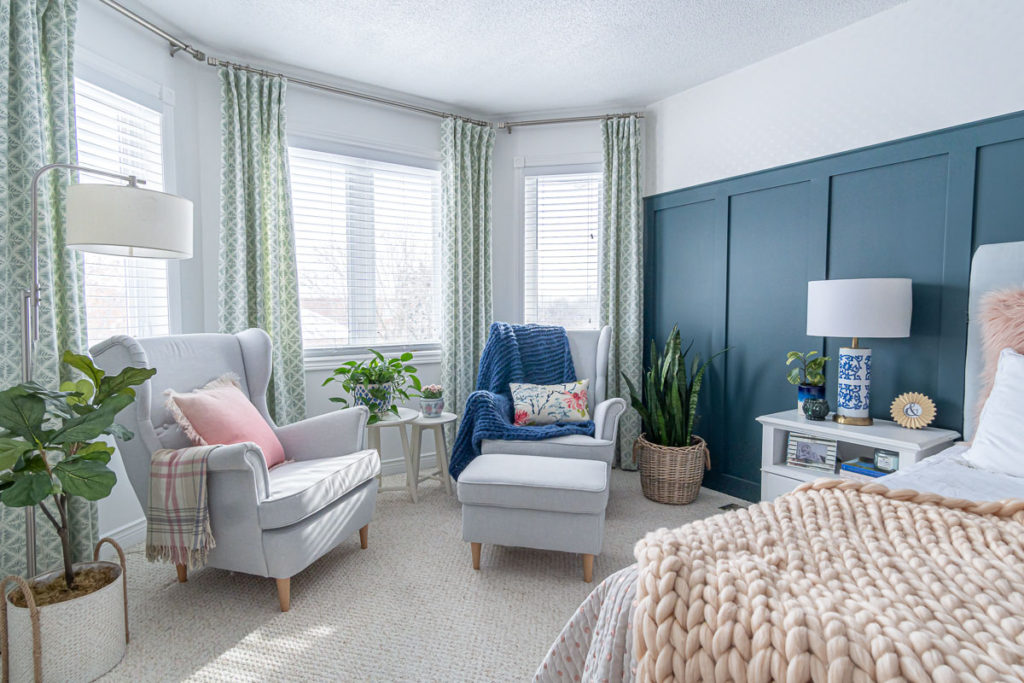
I won’t lie though, I was SUPER nervous. While we painted a darker colour on the board and batten in our powder room last year, it was a much smaller and somewhat quirky space. Our master bedroom on the other hand was a much bigger space, meaning the dark colour would likely have a huge impact.
But once the first coat was on, I knew it was the right decision! We used Valspar Signature Paint which is both a paint and primer in one. The texture was so nice and the colour so vivid! It dried super quick to the touch, making the recoat time faster than other paints I’ve used. Also, because it’s winter time here and we can’t really open the windows, I was happy to discover that there was almost zero smell to the paint. We continued sleeping in the room right after we’d paint the wall because there was just no smell whatsoever.
We also refreshed the rest of the walls, door and window casings and trim with Valspar’s “Ultra White”. This isn’t the first time we’ve used that colour and it’s because we absolutely LOVE it. It’s such a PURE, crisp white. It freshens up a space INSTANTLY! I think it’s my absolute favourite shade of white that I’ve used!


While I knew the look would likely be dramatic, I don’t think I could have anticipated how dramatic it would look once we placed the headboard back up against the wall, made the bed and set up the nightstands. The layers to textures and the depth of colour are absolutely perfect, in my opinion!

It goes to show just how much of a significant change you can make when using paint, adding some mouldings and some wallpaper to a space. This refresh cost us less than $200 and took about a week to finish (working on it here and there). It really is a doable project that just about anyone can tackle. If you are looking for a complete tutorial on how to instal board and batten, check out THIS post.
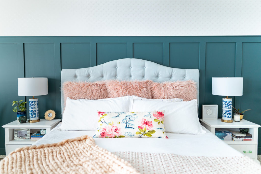
Well there you have it friends – our master bedroom refresh with Valspar “Sequoia Glade” paint! I hope it’s inspired you to get a bucket of paint this weekend and tackle that room that is just BLAH in your home. Get creative, get colourful, get out some tools and add some texture to it. Paint it, shop your home to find fresh decor for the space and create a room that inspires you! It doesn’t have to cost much or require a full gut job to create a beautiful place like this!
Love & Blessings,
Christine
Note: This post was sponsored by Valspar Canada where I may have received product and/or compensation in exchange for my honest review. As always, the thoughts and opinions expressed are 100% my own!
