As long as I can remember, I’ve never really known where I fit in. I wasn’t a cool kid in high school, but not a book nerd either. I wasn’t really athletic or part of any clubs like drama, math or debate teams. While many seemed to have defined groups that they identified with, I often found myself connecting with random people and making friends with all different kinds. It didn’t matter to me whether they were part of a cool club or not; if I liked them, I’d be friends with them.
This is how I’ve continued to live much of my life as an adult and why no two friendships of mine look the same.
You’re probably wondering what on earth these sentiments have to do with an office renovation post, right? Well, let me bring it together for you.
In the same way that I’ve never really identified with one group of people, I’ve never really identified with one style of design. As I look around at many different popular designers or even my personal designer blog friends, many of them have a clear and defined design aesthetic. Whether it’s modern or farmhouse chic, mid-century or even minimalist, designers seem to usually know what flare for design runs through their veins.
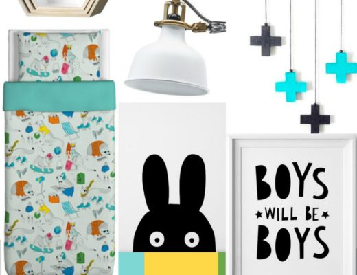
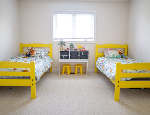
But not so much for me, which probably explains why no two rooms in my home look alike. When asked to describe my style, I always have the hardest time articulating what exactly it is. My kitchen is what I would call Parisian Industrial, my boys’ bedroom would be Playfully Modern, and our master bedroom would be Classic Modern with a pretty twist. Three rooms, one house, with three different styles.
One thing I’ve noticed over the years, especially since we’ve been in our current house, is that I’ve allowed more and more of my playful personality to come out in my room designs. Again, not necessarily sticking to any one trend or design aesthetic, I’ve really tried to find pieces that I love and really represent myself and my family.
So when it came time to renovate my office, I knew it was time to really let that inner quirk come OUT!
Before I get into the inspiration and reveal of the space, we have to start with the BEFORE pictures. Brace yourselves, it was BAD! We had absolutely zero design in there before and these pictures will prove it!
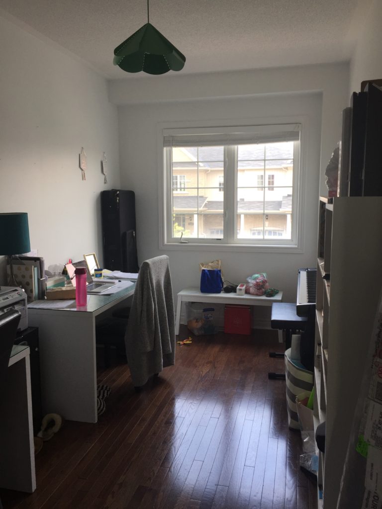
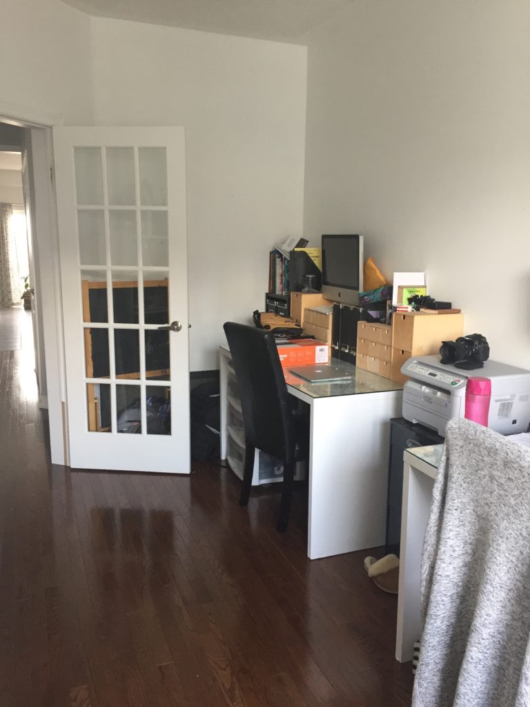
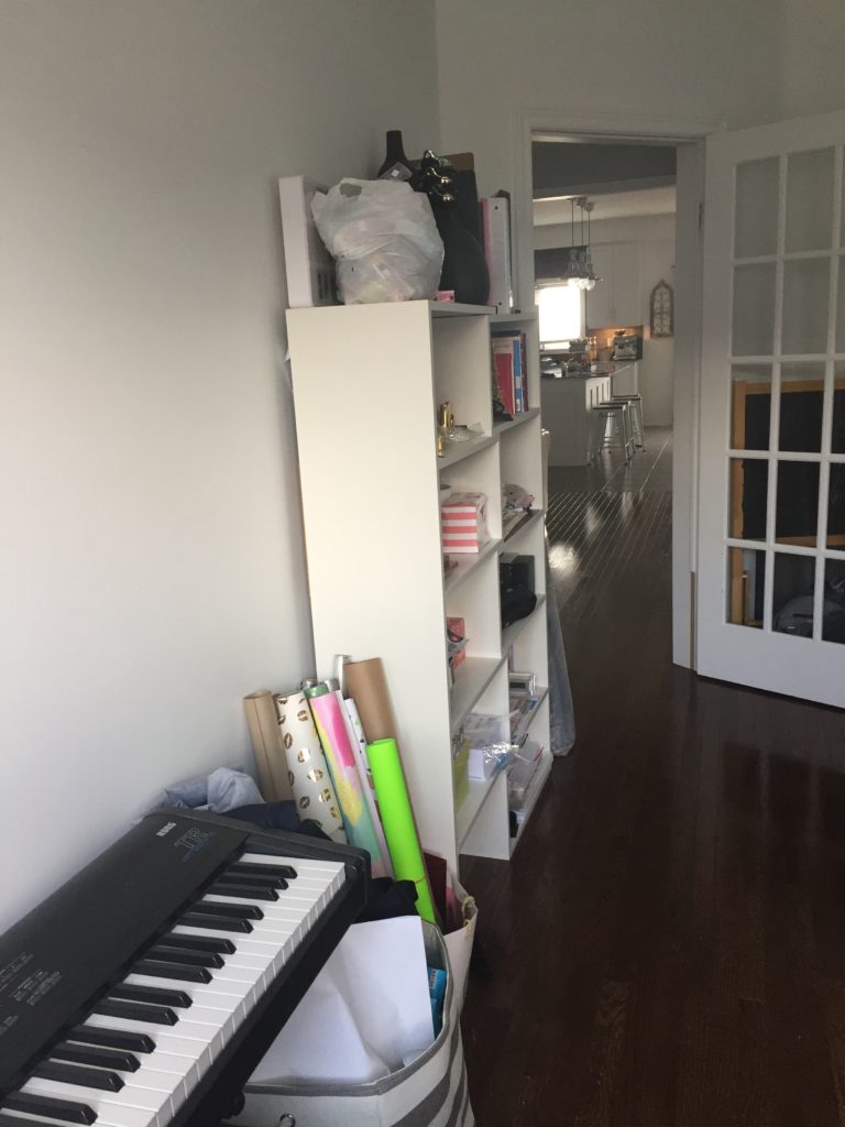
Pretty bad, right? Ok, let’s get back to the inspiration behind the design for the office makeover!
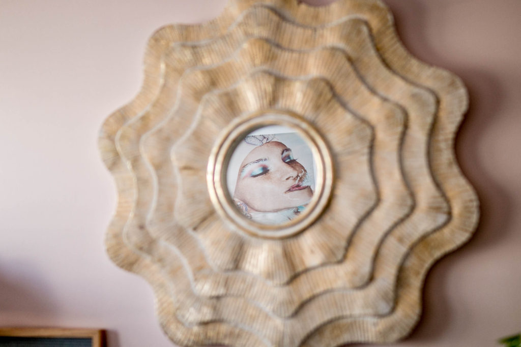
You see, I was inspired by images I had seen on the ceiling of a hotel on a recent trip to Orlando, Florida. They just did something to me. It’s probably because I used to be a synchronized swimmer and they reminded me of that time in my life. I was so proud of how hard I had worked at synchro and I loved that it combined both sports and arts together. I still am fascinated with synchro any time I see it on TV or online, so when I came across these images, I was struck by the beauty and the playfulness of them. I immediately knew that they were going to be the inspiration behind my office makeover. And luckily enough, I was able to get in touch with the original photographer Zena Holloway who gave me permission to reprint the images from the hotel ceiling!

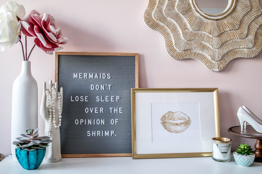
I decided on a retro underwater aqua and pink theme. I knew it was important to marry the modern and retro together for this space in order to reflect the true feelings behind these portraits. I searched high and low for both store-bought and antique pieces that would help tell this story. I’m SO happy with how it turned out!
Ladies and Gentleman, I give you my office makeover REVEAL!
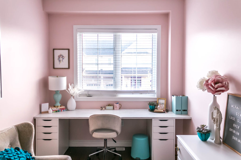
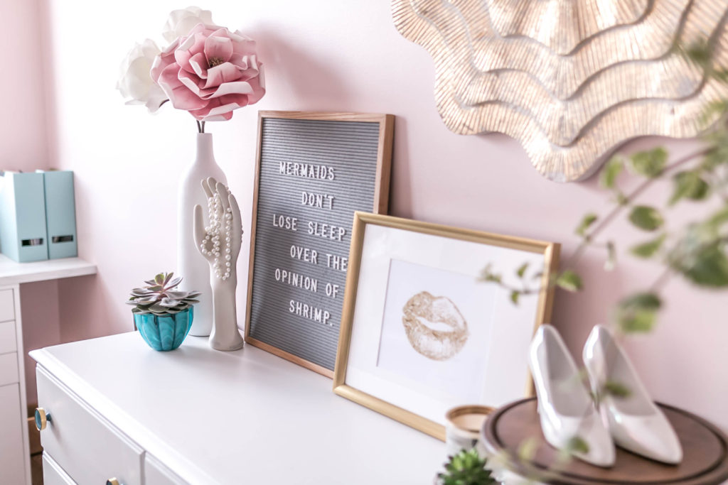
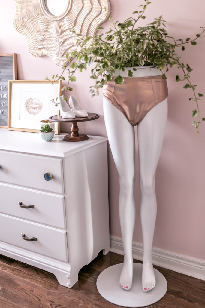
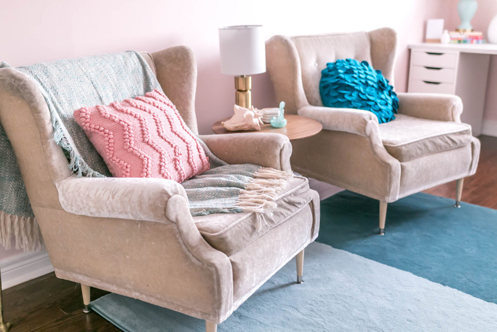
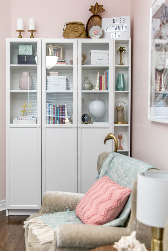
Typically with most room transformations, you begin with changing out the wall color. In recent years, I’ve completely flipped from my normal colourful ways and gone mostly white and neutral. I’ve found that white is such a good base to really let other colours pop against. But with this space, I knew I wanted to try something more fun and daring.
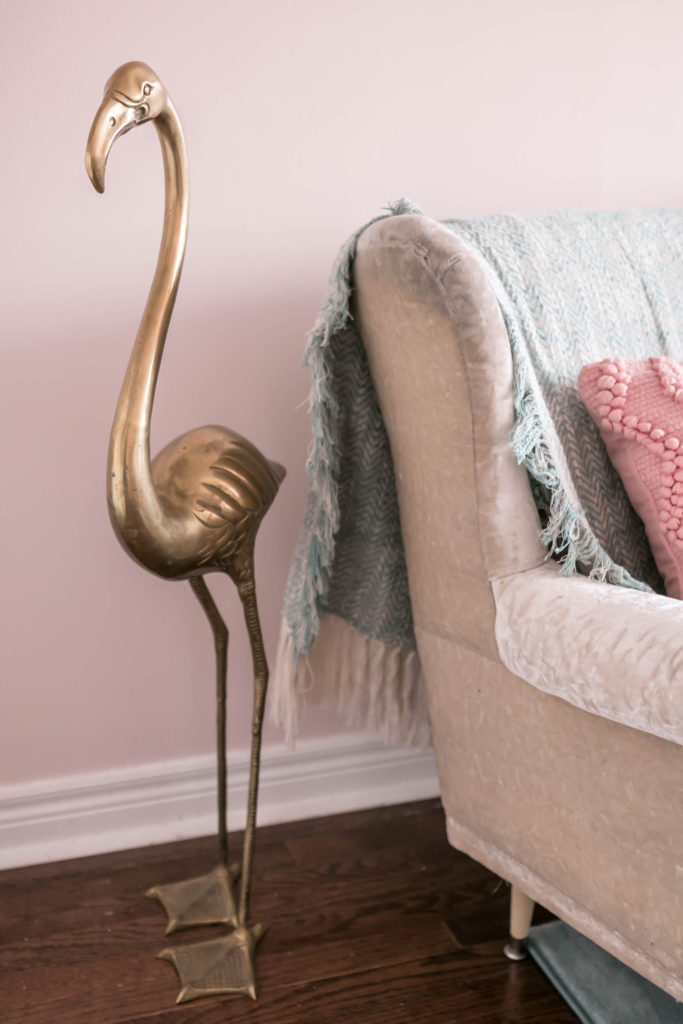
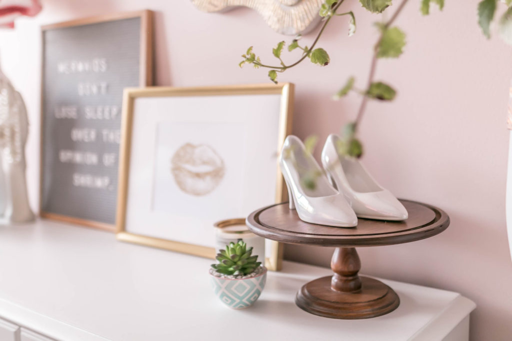
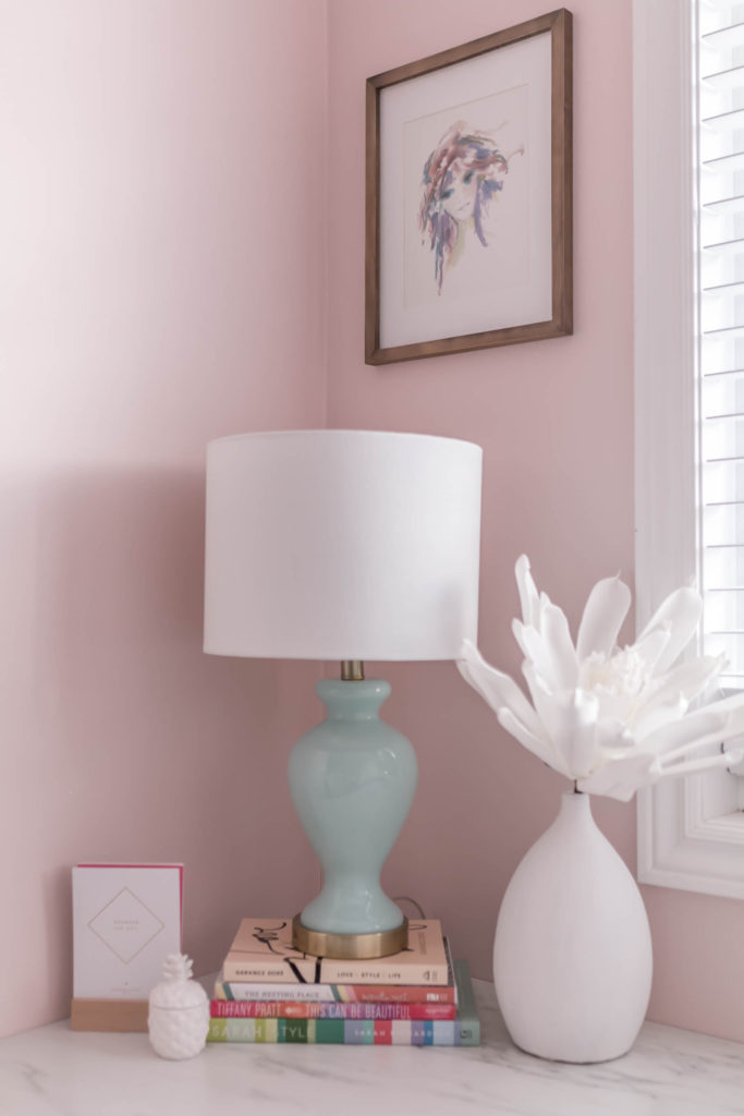
When I came across the colour Stolen Kiss MQ3-34 from the BEHR MARQUEE® Interior One-Coat Colour Collection, I was SOLD! It was a perfect peachy-pink, which totally went with the retro feeling. I also felt like it was more of an adult pink, if that makes sense. I find many shades of pink can feel very young and girly, so it’s important, when doing it in an adult space, to really find the perfect shade that communicates playful but still sophisticated.
I’ve tried many different kinds of paints, but this was the first time I had ever tried BEHR MARQUEE Interior Paint. Let me be completely honest when I say I was skeptical about the claims that it was one-coat coverage guaranteed. Again, having painted MANY rooms over the last 12-plus years, I have NEVER only done ONE coat of paint on a wall before. I bought two cans because I was certain I would need both, but let me tell you, the second can has NOT been opened! It completely WORKED! I was shocked!
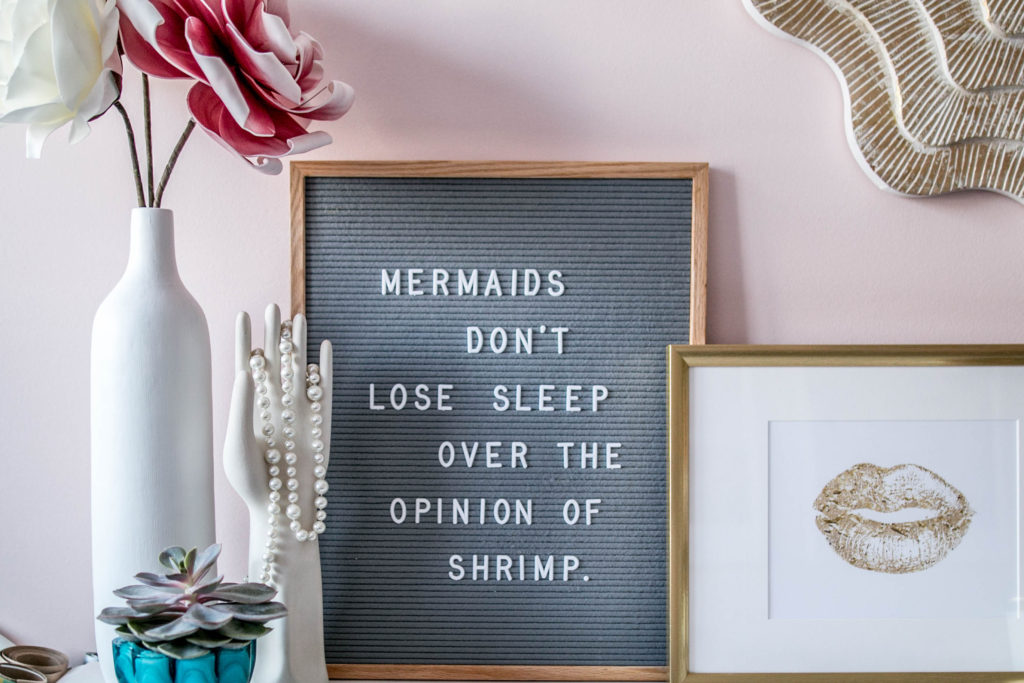
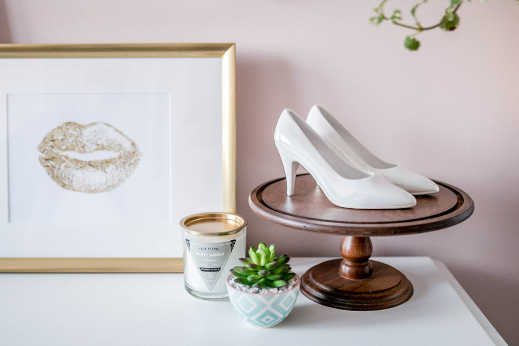
The paint is very thick, to the point where you can even feel that the brush and roller are heavier than normal once the paint is on them. But it honestly is one-coat coverage! There are a couple small areas that I could touch-up, mainly the places where I cut in with a paint brush along the trim, but that being said, I haven’t done those touch-ups as they are barely visible unless you look really closely.
Typically when it comes to painting a room, I find I often dread the process, mainly because it’s so long and can be quite back breaking at some points. Being able to only do ONE coat and call it a day was honestly an AMAZING feeling and made the transformation of the space go so much faster.
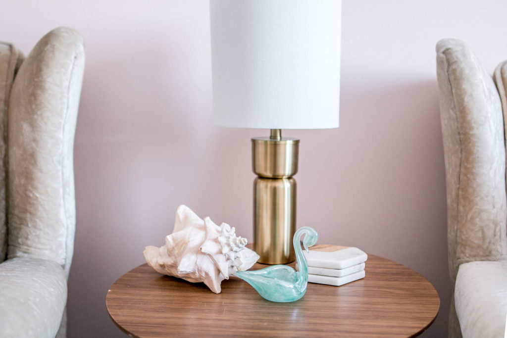
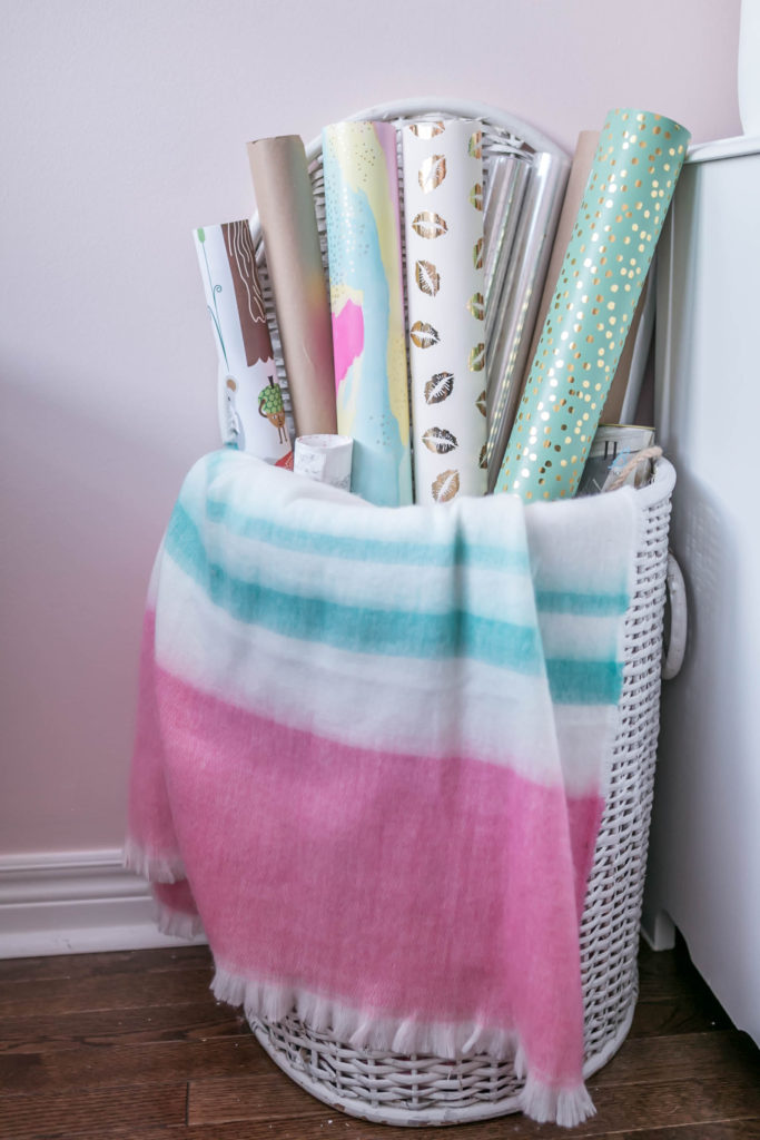
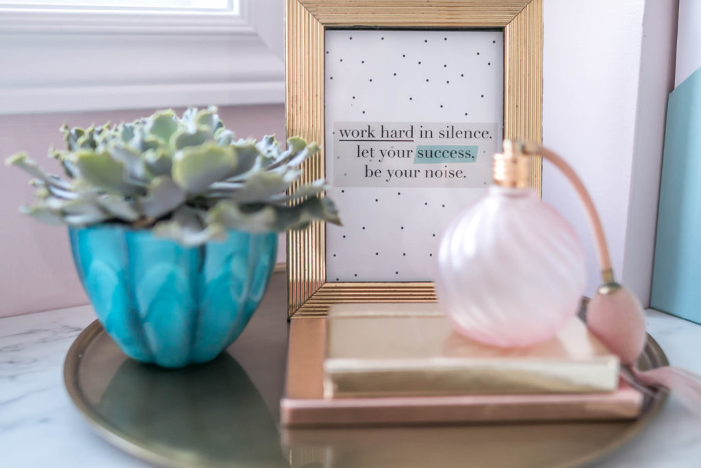
BEHR MARQUEE Interior Paint is truly one of the best paints I’ve ever used, hands down. If you are looking for full coverage in ONE coat, look no further. I guarantee you will be super pleased with the results!
I hope you enjoy this room renovation and all the little quirky, fun items in there. Come back next week as I talk through the various pieces in the room, where they are from and how I put them all together! I’ll even tell you more about that mannequin planter!
Happy Painting!
Note: This post was sponsored by BEHR® where I may have received product and/or compensation in exchange for my honest review. All opinions are 100% my own. Thank you for supporting the brands that help make Amidst the Chaos possible.

