Welcome to Week 5 of our Bohemian Glam Office Renovation that we are doing along with the One Room Challenge. We have been renovating our office for the last four weeks and have only three weeks left to go! If you are new here, why don’t you catch up on the last four weeks here: Week 1, Week 2, Week 3, Week 4.
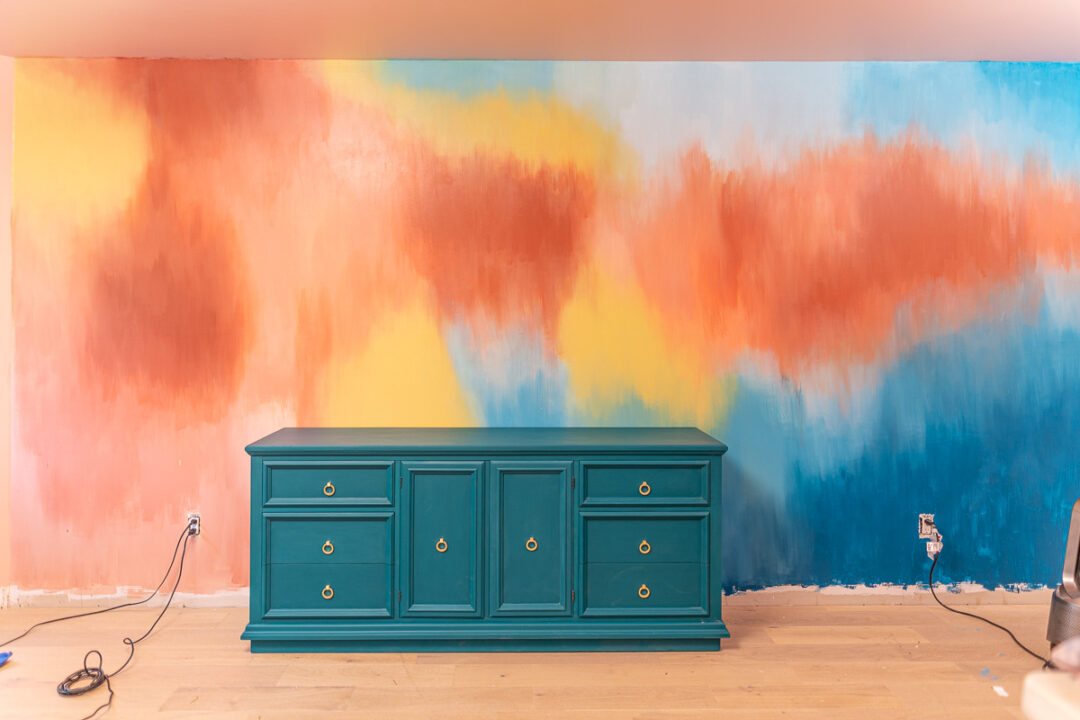
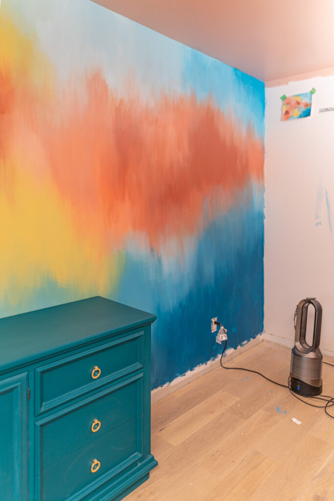
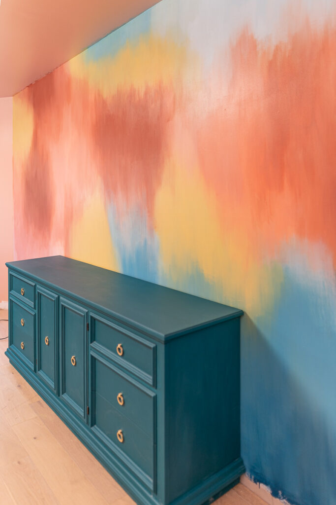
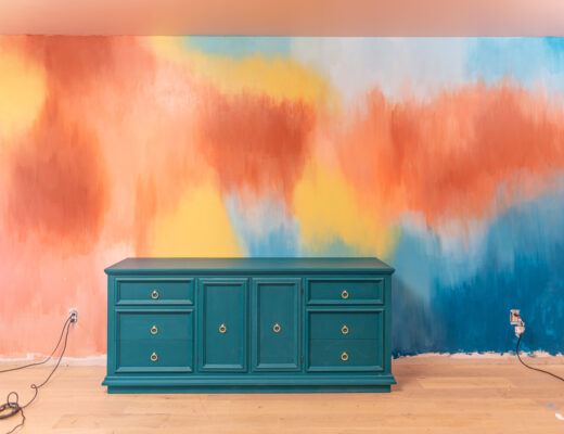
This week was all about the main feature wall in the space. Typically when renovating a room, I like to include some kind of feature wall – whether it will be with an architectural point of interest or a patterned wallpaper or a hand painted mural. Having a feature wall really brings your attention to a centre point in the room and is a great jumping off point for the overall design.
Originally, I was looking for wallpaper for this wall, but as I was scouring the internet, I found I had a REALLY hard time finding something that both went with the bohemian style I was wanting but also that my husband would approve of. See, this office space is a shared office space and while he usually lets me do (mostly) whatever I want with my rooms, he really didn’t want anything too “girly” in here. I kept striking out on the wallpaper options and then I came across a video on Pinterest of someone painting a mural. I was immediately drawn to it and when I showed my husband, he loved it too!
I quickly learned that the hand painted mural was created by Kelly Aiken from Copeley Designs, out of Charlotte, North Caroline. She has an in-home studio but also does custom murals for many clients and has even been featured in West Elm. Not only did I love the colours she was using and how they blended in so well with each other, I was completely drawn into her use of gold leaf on the actual murals! We’ve toyed around a little bit with gold leaf, particularly last Fall when we made our custom range hood and gold leafed all the trim around it, but I’d never thought of putting gold leaf right onto my walls before. I’ve come to learn that this is Kelly’s original idea and something that she’s become known for as she loves to incorporate gold leafing all throughout her designs!
Once we had decided that this is what we wanted, we knew that there was no way for her to come to us to create it (hello, pandemic and closed borders), so the next obvious choice was to try and figure out how to do this mural myself. <deep gulp> I have attempted two other murals before, both actually in my daughter’s room. There was the floral mural, which I completely free handed and absolutely loved the way it turned out. Then more recently, I hand painted a mural of cacti in her new bedroom. While both of those took some time, they were relatively easy and turned out well, so I knew I could likely do it again.
I reached out to Kelly on Instagram and she quickly became an instant friend and cheerleader through this whole process. We sent so many voice memos back and forth and she was so gracious to offer up so many great tips and advice on how to get a similar look on my mural. We actually even did an Instagram Live the other day, which you can watch down below where Kelly answered some questions and gave some great tips on how to get this kind of mural started.
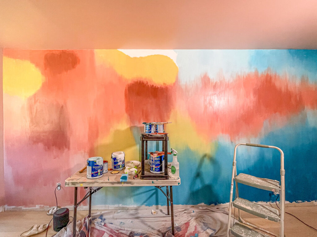
The biggest piece of advice Kelly gave me was to practice the mural before hand on a piece of cardstock paper. This gives you a general idea of how you want the mural to look and something you can keep referencing during the painting. You can see my practice mural stuck up on the wall below – I can’t moving it around and referencing it constantly. While it didn’t turn out exactly like it (also the mural isn’t quite finished, notice no gold leafing yet), I was SO glad that I had a reference point to keep looking at as somewhat of a guide while I painted.
I won’t give away all of Kelly’s tips – you’ll have to go watch the Instagram Live to hear more, but here are a few pointers I want to share with you, now that I’ve spent the last 72 hours working on this mural. I’ve learned a number of things – including the fact that I don’t know that I’d ever attempt this again! HA!
1. Plan ahead
Like Kelly mentioned, practicing it ahead of time on cardstock is crucial for success during the mural painting process. I actually painted three murals before hand on cardstock to help get the hang of what I wanted to do. After that, I chose which one was my favourite design and used that as my guide.
2. Stock up on paint brushes
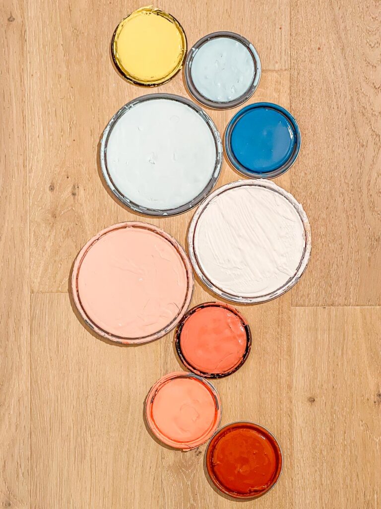
Kelly had told me to get A LOT of paintbrushes and I thought I did but I was constantly running out! I used NINE base colours and then created about five additional colours to help create that ombre look. You don’t want to be mixing those brushes up.
Along with getting enough paint brushes for painting, I actually discovered that I ended up using two additional brushes “dry” – meaning, I didn’t dip them in any paint, I simply used them to blend colours on the wall.
This is probably a good place to mention the colours that we used for the mural, all courtesy of our fabulous friends at Valspar Canada! They have been such amazing partners and were so excited when I said I wanted to do this mural (most of our previous partnerships, I’ve kept it quite neutral the colours).
Here are a list of the colours we used to create this mural (I’ll include the codes if you want to order any of them):
– 24 Karats (3008-6A)
– Ocean Soul (5009-9)
– Sea Tickle (5005-7B)
– Tropical Spray (5004-7A)
– Remember Me Red (2001-7A)
– Rhapsody (2002-5C)
– Coral Reef (2004-4A)
– Semi-Precious (2001-8B) – this is the colour of the other walls & ceiling too!
We did also use some leftover white paint from our previous renovation to add in a few spots to lighten up the look!
3. Use a spray bottle of water
If you are wanting a similar ombre effect, you are going to need water to help achieve this. I also made sure to have some sponges on hand to help catch any of the “drips.” That wasn’t a look we were going for – so if you don’t want the water to drip down, make sure to get some sponges.
4. Blend, blend and blend some more!
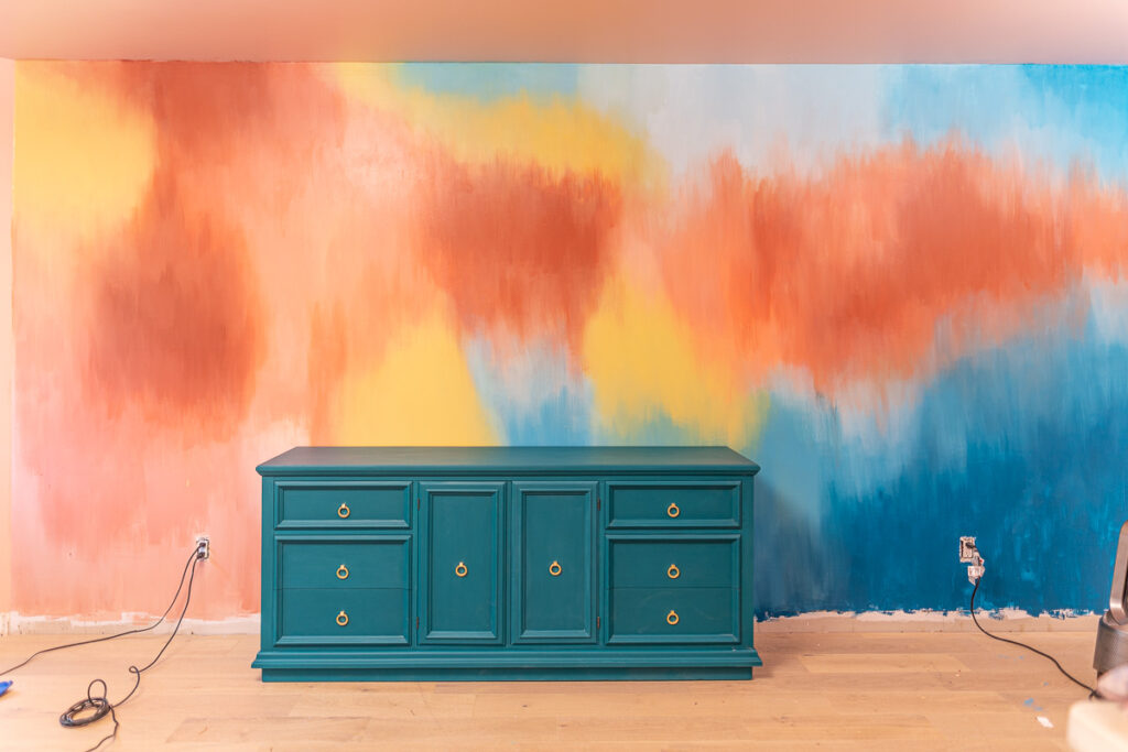
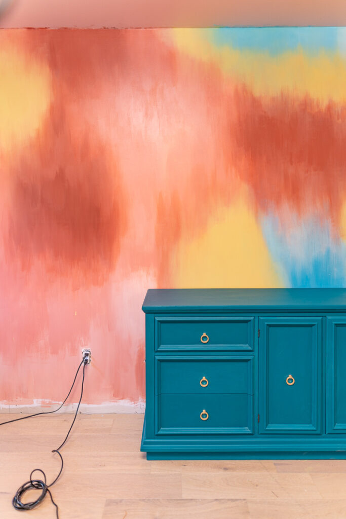
I completely underestimated how much I was going to have BLEND these colours! If you look at this picture below, you can see on the left side how not blended the colours were (even though at the time, I thought they were blended). As I kept going on the mural (moving from left to right), I started getting better at blending and realizing I actually needed to blend WAY more. So you’ll notice in the other pictures, I did go back and re-blend that left side where I first started.
5. Give Yourself Lots of Time
I cannot express this to you enough – give yourself LOTS of time to complete a mural like this. The previous two murals that I did were done in about one day’s time. This mural was in a whole other level. Likely because of the sheer size of the wall, but I severely underestimated how much time it would take to blend in each colour. As it stands, I still have to go back in a tweak a few spots and still have to do the gold leafing (that reveal I’ll save for the final reveal during Week 8)
Overall, I’m fairly happy with how it turned out. I will admit that I doubted myself A LOT during the process. This space is really unlike any I’ve ever done before and I find it’s taking me out of my comfort zone. Things aren’t matchy-matchy like I typically like them to be. Also, there isn’t a ton of readily available inspiration for bohemian glam out there. So I’ve found the last few weeks a good design challenge for me as I flex my design skills along with painting more things that I think I ever want to paint again!
Well friends, my arms are officially exhausted from all the blending so it’s time to wrap this up! Thank you again for following along this journey! We are in the home stretch now and have lots of work left to do to get this space up and running! Stay tuned!
Love & Blessings,
Christine
Note: This post was sponsored by Valspar Canada, who have been a longtime partner of Amidst the Chaos. We appreciate their ongoing support of our projects.
Special Note: I want to thank Kelly Aiken again for sharing so many of her amazing tips and allowing me to learn from her and use her design as inspiration for this mural!

