It’s no secret that this last year has been an unusual one where many of us have had to forego our much-anticipated vacations and hunker down at home. With that, I’ve noticed many more people renovating their homes and making their indoor spaces truly reflect who they are. We’ve undergone a number of renovations this year with a couple more up our sleeves still to come. So I was thrilled when Flooring Canada reached out and asked me to come up with a fun mood board design based on their top 10 flooring samples in this years Style 2021 Watch.
The task was simple: they would send me 10 flooring samples plus a design kit and I had to come up with a mood board for a potential room design in my home, using some (or all) of the items they sent me. I was really excited about this proposal because not only do I LOVE the early design process of putting together a room, I often get asked by YOU guys how it is that my designs come together for a space. So I thought this would be a great way to walk you through my design process and see what I came up, using many of the things that Flooring Canada sent me!
So let’s get right into, shall we?!
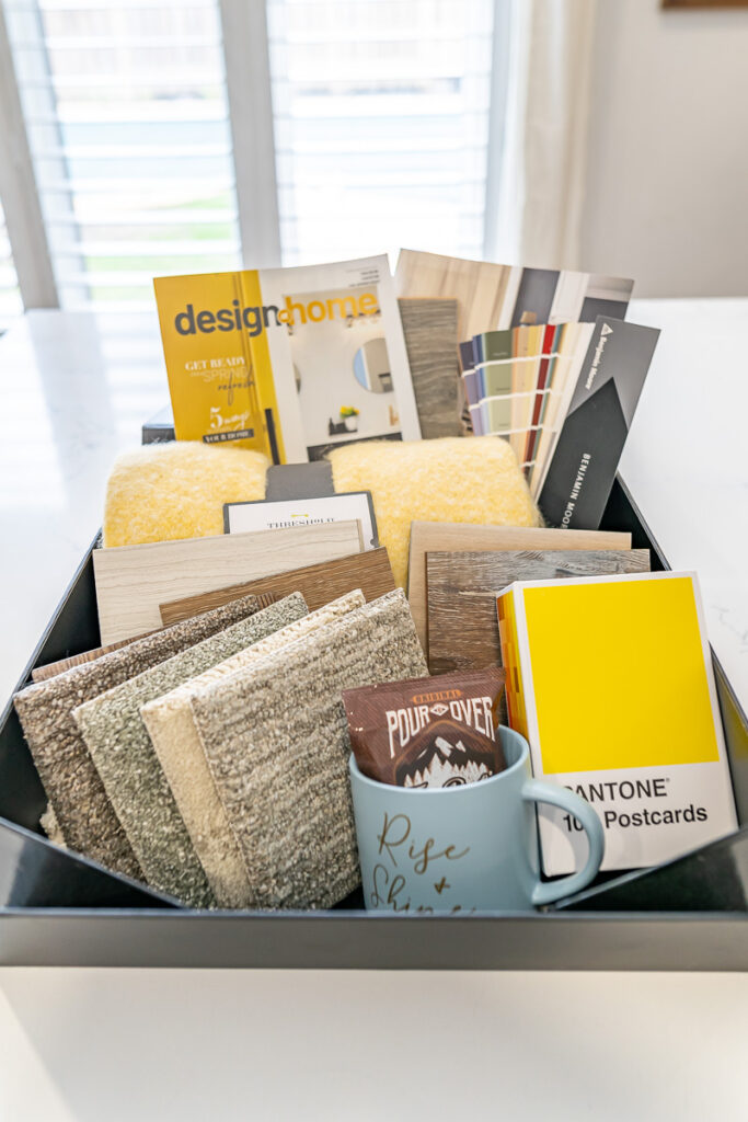
To get me started, Flooring Canada sent me this amazing box that was filled with the following items:
- 10 flooring samples from their Style 2021 Watch
- “Design at Home” magazine
- 100 Pantone Colour Postcards
- A Benjamin Moore paint fan deck
- Yellow Threshold Blanket (oh Target, how I still miss you!)
- “Rise & Shine” blue coffee mug with a packet of pour over coffee
- A couple of gift cards to help me purchase some extra items for inspo!
To start, let’s talk about the flooring samples from Flooring Canada. Whether you realize it or not, great room designs start with a really great floor! I know flooring isn’t always the sexiest part of design, but it’s arguably one of the most foundational (literally and figuratively). It grounds your space not only in design but also with function and durability. So it’s important to make sure that any space you are designing starts with great flooring!
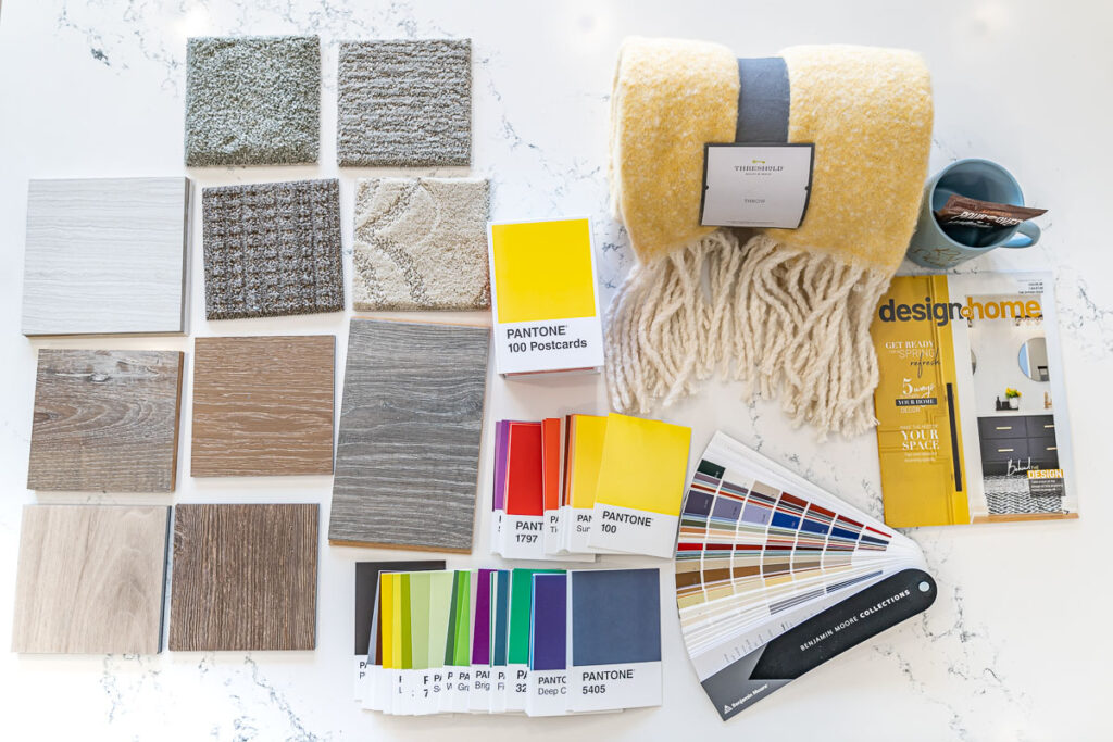
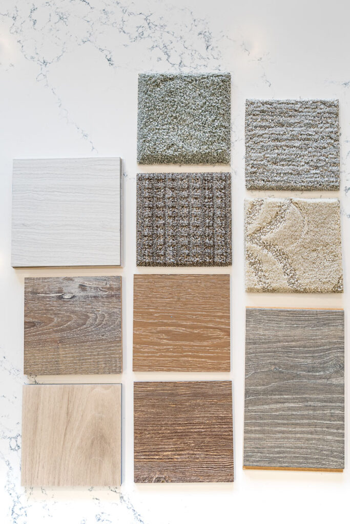
With the Flooring Canada Style 2021 watch, they’ve carefully selected 10 of the most innovative products that the flooring industry has to offer combining style, technology and durability while still spanning multiple categories of flooring aka – there’s something for EVERYONE!
Wood:
- Hazelbaker – Sliced Hickory White, Rin
- Oceana Estate – Oak, Upland
Tile:
- Floorcraft Ceramic Tile, Tower of White Matte
Vinyl Tile:
- Paramount Plank, Scree
- Melbourne, Moss
Laminate:
- Floorcraft Maysville Ash Grove Oak, Granite
Carpet (Broadloom):
- Swagger, Pennicott
- Hedon Plus, Soft Sage
- Life of the Party, Corporate
- Why Me, Wind Swept
Okay, now that we’ve established what we have to work with, it’s time to start designing. I always find that in any space I design, there’s always something that SPARKS as my starting point of design. Whether it’s a picture I see or a colour palette I love or a destination I want to visit – I always have to have that something that gets the creative juices flowing.
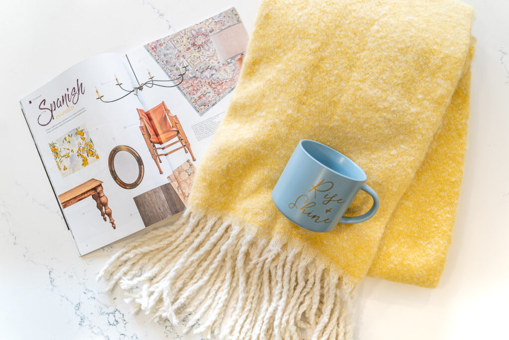
For this design, it was actually the yellow throw blanket and the light blue mug. As soon as I saw both of those elements, I envisioned somewhere sunny near the water. I wasn’t surprised that my mind started wandering to places far away as I haven’t travelled anywhere in over a year. Like so many, my heart has been longing to travel again, and so with that in mind, along with the two colours, I knew it was going to be a destination-inspired design.
Often times in the very early design stages of a space, I find myself surfing Pinterest or decor magazines to get some inspiration. So I decided to leaf through the “Design at Home” magazine by Flooring America that was included in my design kit and stumbled upon this gorgeous Spanish inspired page. I knew INSTANTLY that this was going to be the direction I was going to go in but a slightly more sunny, oceanside vibe, incorporating the bright yellow and ocean blues.
One of the pieces I was most inspired by was actually the vintage picture of the fruit trees in the magazine. I loved that it not only incorporated the yellows and blues but also there was such a vintage feel to it, which I felt really reflected the rich heritage that comes with a Spanish inspired space. I scoured the internet to find something similar and quite frankly, I just couldn’t find anything that came close to that image. So, I decided to order the exact same image from Etsy! It’s just THAT beautiful and perfect for this design (and it’s definitely going to find a permanent spot in my home soon).
Next up in the design process is adding in all the colours. That can sometimes be one of the hardest aspects of design (at least I find it to be for me). There’s just ENDLESS options! And not only that – but actually finding a colour that not only works with everything else you have designed for the space AND works well during the daytime and nighttime can also prove challenging. I’ve literally had to repaint rooms before because the way the colour looked at night versus the day was just ALL wrong.
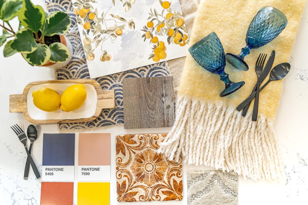
I selected these four colour swatches from the Pantone Post cards box – while they not might be the exact colours I would do in the space, they give the general idea of what I’m going for, especially when it comes to accessorizing. An ocean blue, a mustard yellow, a terracotta burnt orangey red and a dusty pink.
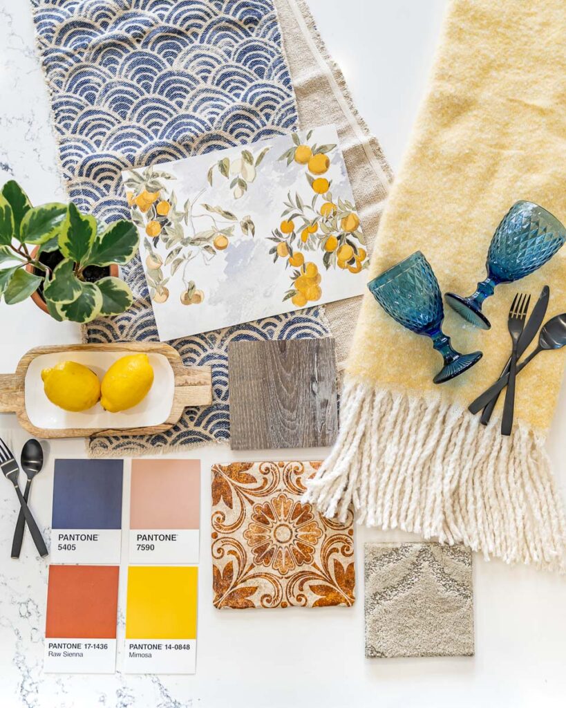
When it comes to which Flooring Canada samples I chose, here are the two: Hazelbaker Sliced Hickory White in Rin for the wood and Why Me in Wind Swept for the carpet. Obviously which flooring I’d choose would ultimately depend on what room I ended up doing for this. As the mood board likely suggests, I ended up designing this board with the intention of it being a kitchen. So if it was a kitchen application, I would for sure go with the wood. I loved the sliced hickory with the white wash on it which gives the wood a distressed look. You can see streaks in the wood as well as knots which gives the flooring so much natural character. It has a modern yet vintage vibe which I think works perfectly with the Spanish oceanside inspired design.
I want to make a note here that the Hazelbaker Sliced Hickory White in Rin is only available on Flooring America, not Canada. So I wanted to provide an alternative for my Canadian friends who might want to select something similar. My selection would be Lanes Prairie White Oak in Tundra. Not only is it waterproof, it’s also 7.5 inches in width which I absolutely love! It makes such a statement to have wide plank hardwood in your space!
Where I’d use carpet is this application would be two different ways: 1. if this was a bedroom – there’s still lots of people who love carpet in their rooms (me being one of them) and 2. if this design was in a kitchen and there was an adjoining living space where someone wanted it carpeted. What I love about this specific broadloom is the pattern in it – it makes for a bold and statement-style carpet. There is movement in the pattern which I think represents the movement in the waves – again, making it a perfect match for this oceanside theme!
I also should quickly mention the Spanish-style backsplash tile that I found online. If this space was going to be a kitchen, I do love a bold moment for the backsplash to add some colour, interest and pizzazz to the space!
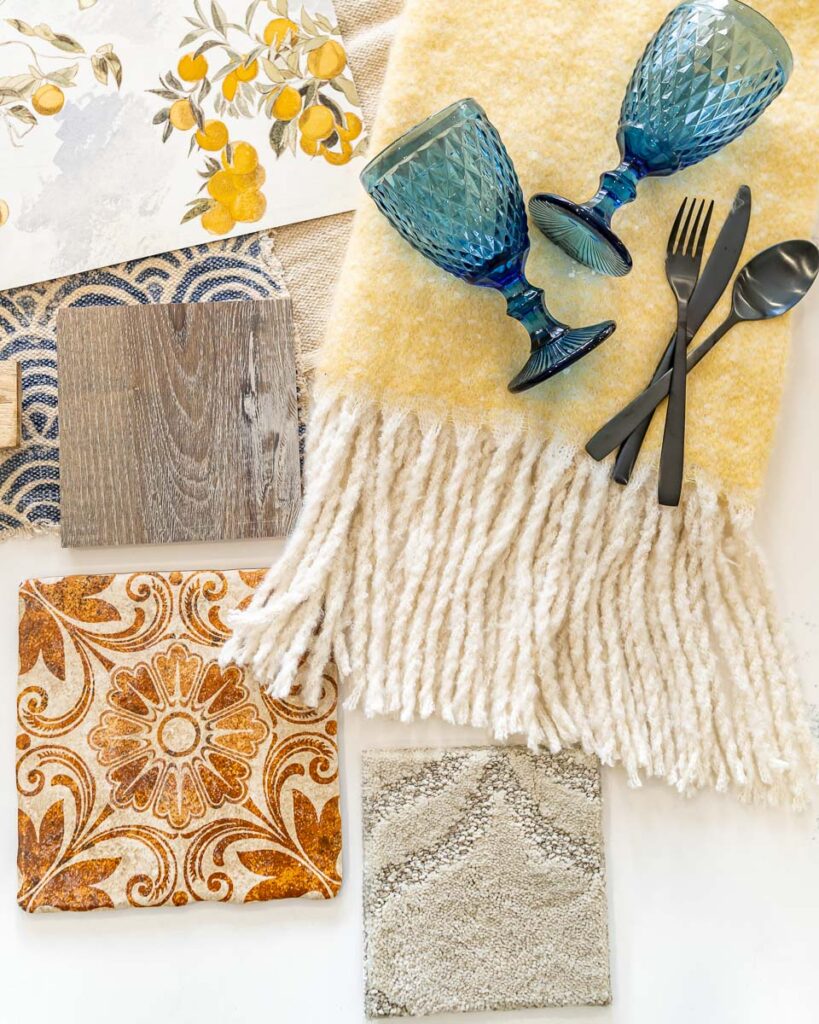
The final part of in creating this mood board and ultimately setting the design for the space, is in the accessories! This is hands down my FAVOURITE part of any design. To me, this is where your design really starts to come alive before you’ve done a thing to renovate the space. By curating your mood board with textiles, artwork and other various accessories, you are starting to tell the story that your space will tell. You start to build in the character, depth and interest that your design will reflect. Each piece needs to have a purpose, a story and a way to tie everything back together.
I will say that trying to create a mood board in this current climate when I couldn’t go out shopping anywhere (hello Ontario 3rd lockdown where every single home decor store and section in big box stores was closed) was a BIG challenge. But I’ve never met a challenge I couldn’t take on! Almost all of the accessories that you see here I actually was able to source from Simons online and was thrilled with how it all came together. While this process can be long and tiresome, I feel like it’s a great treasure hunt – what can I find that will work!

The blue table runner was one of the first things that caught my eye and knew I had to have it. The abstract waves with the fringed edges could not have been more perfect for this Spanish oceanside inspired design. You can’t do a Spanish design without some terracotta incorporated so when I found this gorgeous irregular pattered terracotta plant pot I knew it would fit in perfectly. I also love incorporating natural materials into any design and I knew wood was a pillar in Spanish design, so this little wood enamelled tray was perfect. I love the raw wood with the food safe enamelled interior is perfect for serving food or even just using it as a catch-all tray. I knew I wanted matte black utensils – while that is used in more modern decor, I feel like it still has a real vintage flare to it and acts as a good anchor and contrast to all the other elements. Tying everything together were these embossed diamond wine glasses in marine blue. I mean, could you get more ocean vibes than with this glass?! I just love it!
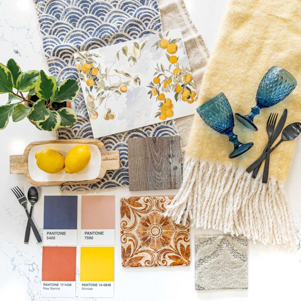
Well there you have it my friends, my Spanish Oceanside inspired mood board with Flooring Canada! I legitimately think this might be one of my favourite designs and I might just HAVE to redo a room in my home in order to actually put all of these amazing finds to use!
To find out more about Flooring America and Flooring Canada’s Style 2021 watch, click here to see all the incredible, versatile and budget inclusive options that they have to offer for your space!
Love & Blessings,
Christine
Note: This post was sponsored by Flooring Canada where I have received product and/or compensation in exchange for my honest reviews. As always, the views and thoughts (and designs) are 100% my own!

