It’s here! It’s here! It’s HERE!
Today is week SIX, the FINAL week of the One Room Challenge! And you know what that means, right?! It’s REVEAL TIME!
We’ve been hard at work for the last six weeks to makeover our living room and today we are SO excited to share with you the finished space!
If this is your first week joining us, make sure to check out the previous five weeks before scrolling ahead to get a real appreciation for the journey we’ve taken! Week 1, Week 2, Week 3, Week 4, Week 5.
This living space was the heartbeat of our home and yet was never operating at full capacity. With the awkward shape of the space and the multi-use nature, we could just never wrap our brains around how to set it up in a functional and yet beautiful way. It really is two spaces in one and so for this reveal you are actually getting TWO ROOMS to feast your eyes on!
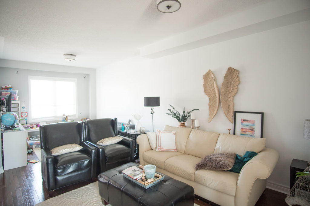
Before we share the reveal, let’s remember what we started with, shall we?! Long, awkward, boring, random decor from previous homes that we tried to make work in this space, lifeless, etc.
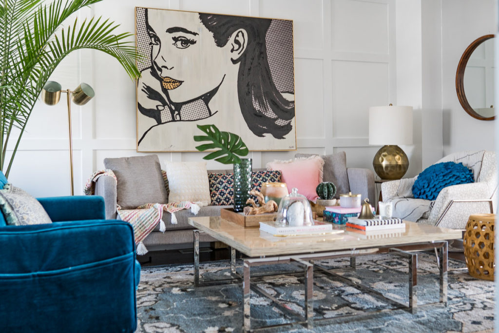
Well, ladies and gentleman, it’s with GREAT pleasure that I present you our finished family living space!
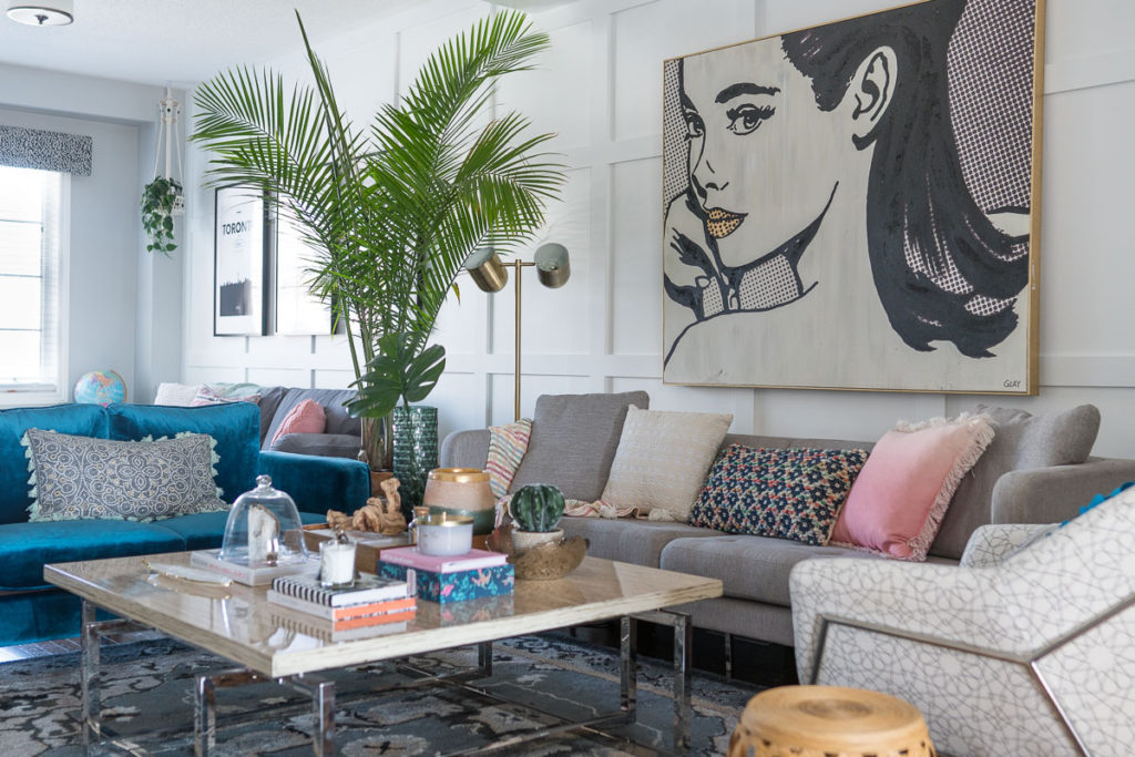
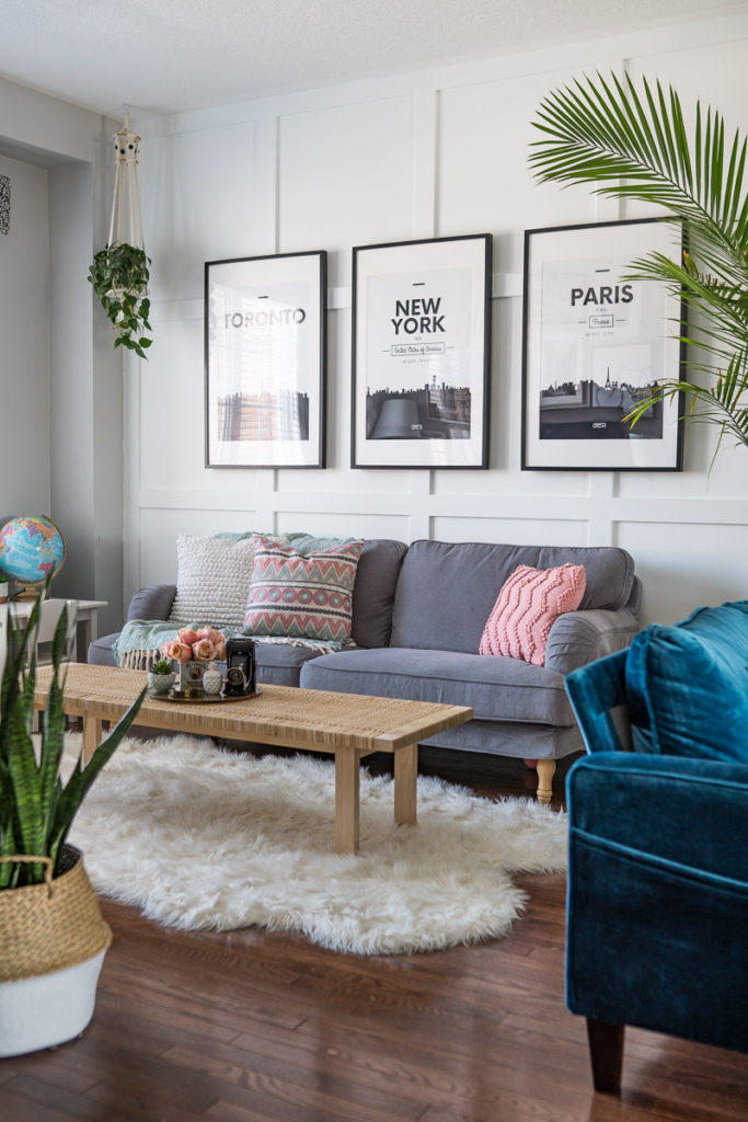
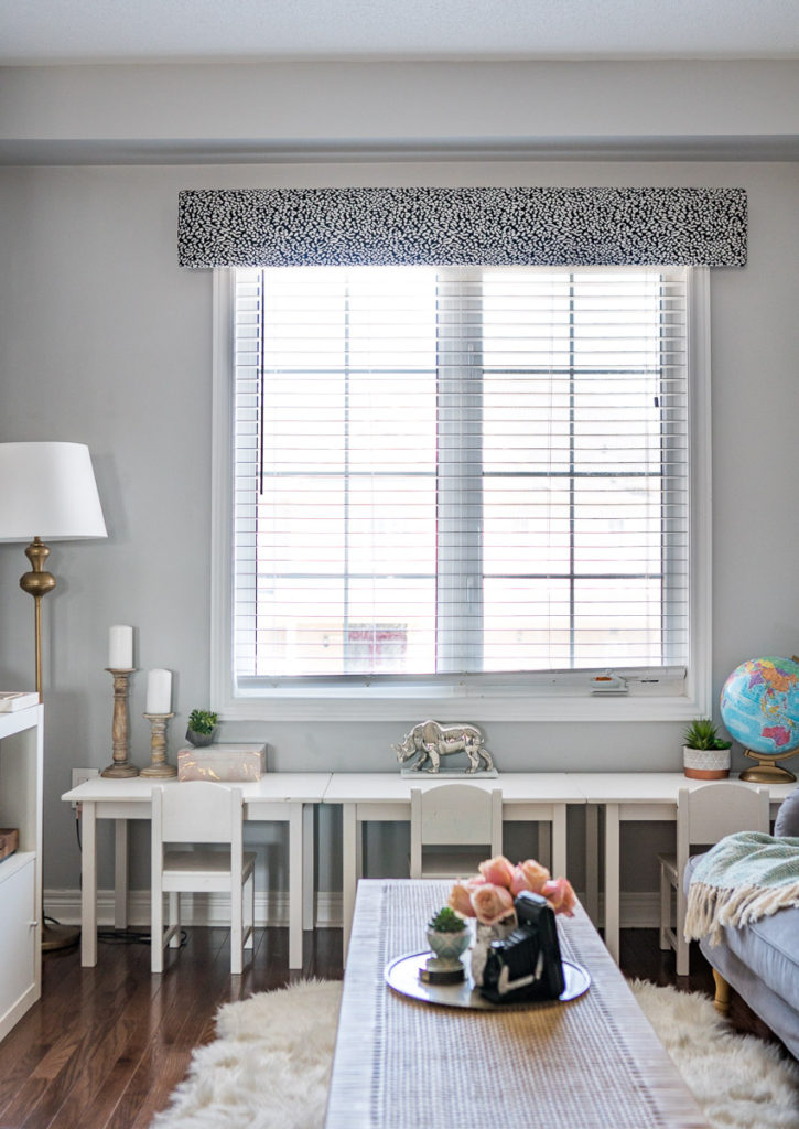
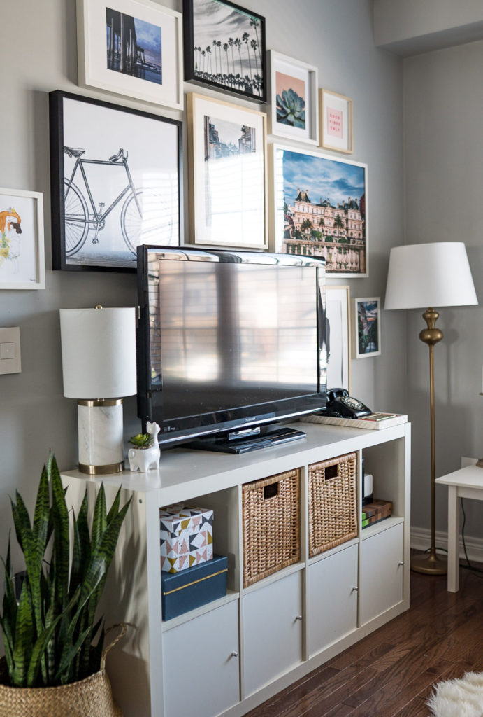
This space excites me SO MUCH! I literally walk down every morning now and a huge smile strikes my face when I remember how we transformed it! It’s crazy how some board and batten, fresh paint, new switches, brand new furniture and decor can completely change and elevate a space into a place that finally reflects the heart of the home.
As I mentioned last week, I really didn’t have much inspiration for the space, which is why it stayed lifeless for four years! But when I walked into HomeSense and allowed myself to really think outside of the box, that’s where the magic happened.
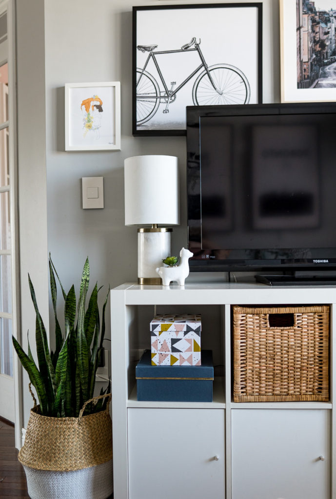
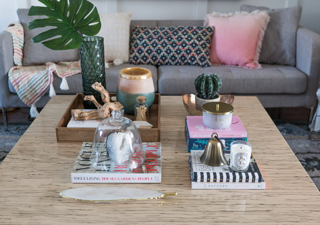
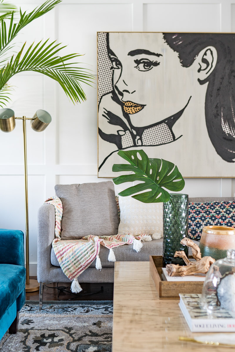
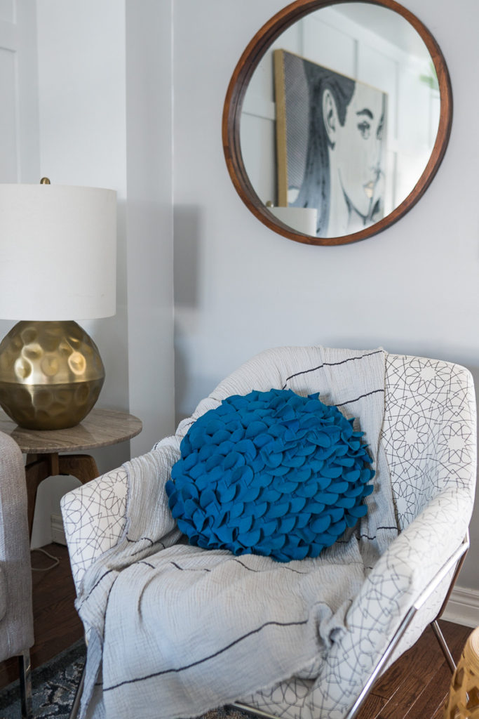
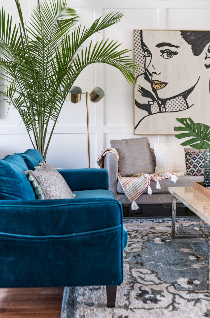
The space is really different from anything I’ve ever designed and I LOVE it! For starters, let’s talk about Audrey – you know, the massive painting of the girl which anchors the entire space! Ya, my kids decided to call her Audrey. Chris hasn’t warmed up fully to her yet, but I know in time he will get there. When I saw her in the store, I was intrigued. There was something about her stare that made me keep circling back and wondering if I should take her home. But I can remember fighting with my own thoughts “You can’t seriously hang a picture like this in your home!” Yet, something kept drawing me back. So I decided to take the leap and just get it! I kept telling myself in the back of my mind “Just because you take it today doesn’t mean you HAVE to use it…” that was my safe escape if need be.
But alas, once Audrey dawned the wall it was clear to me that my gut instinct was right. It’s weird, it’s different, it’s quirky and those are all the reason why I LOVE it! So much about decor is about taking chances and trying new things. Walk a little on the wild side…you never know, you might LOVE it, just like we love our new Audrey painting! Even more special that it’s painted by a Canadian artist Michelle Glay! That’s one of the many, many things I love about shopping at HomeSense, not only are there items gathered from all around the world, they love to support Canadian grown artists too!
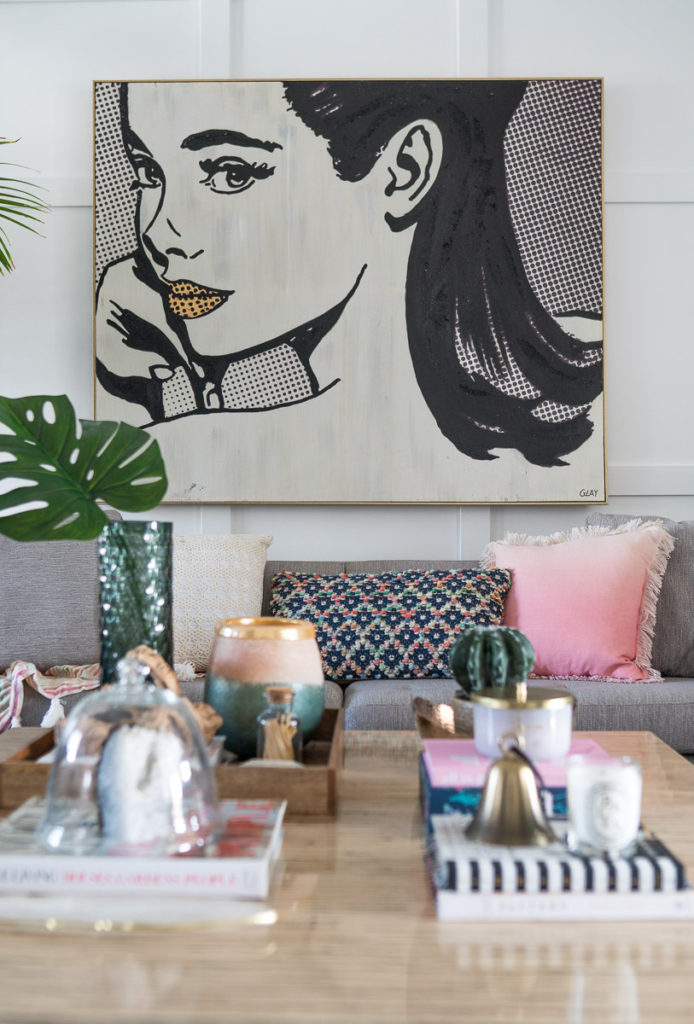
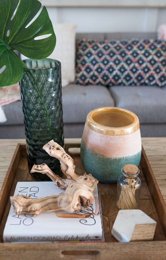
I really don’t know what to call this space in terms of decor style. I was talking about it with Chris today and the best word I felt described it was “Gathered”. Not only do the pieces feel somewhat gathered but the decor styles also come together to create this gathering vibe. There is definitely a lot of modern mixed in with some traditional with moments of vintage as well as global styles. We have so many textures and layers from woven fabrics and baskets and tables to mixed metals to exotic florals to even some animal prints! There’s really a little bit of everything and that’s where I get this really eclectic “gathered” style from.
I will be honest, there was a point where I really struggled with this space. I had “gathered” what felt like a bunch of random items, mostly more modern in feel, and I was really struggling, feeling like this wasn’t MY own space. I could recognize that the design was NICE but I didn’t feel it was ME.
We literally bought FOUR different couches – FOUR!! Chris was absolutely amazing and brought them all upstairs (this living room space is on our second floor) and we set them up together and nothing was working. I remember starting to feel panicked after the third couch came and went because I knew that time was ticking away and I was becoming worried we would not only not finish, but that I wouldn’t like the space.
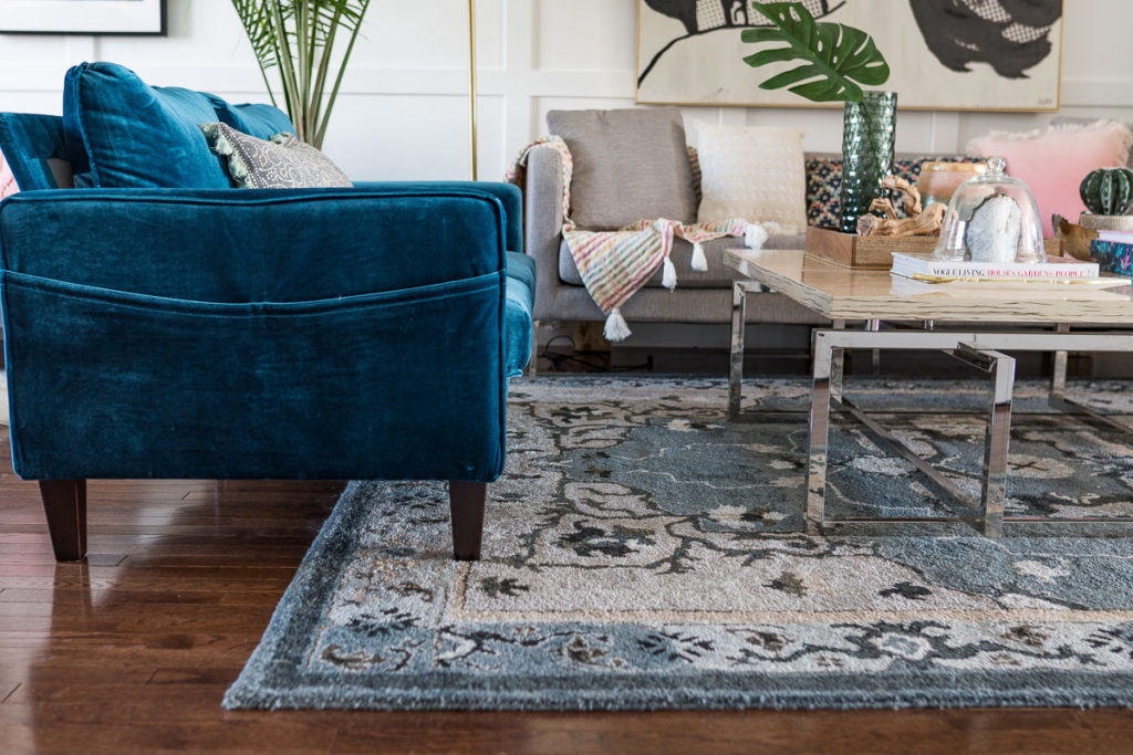
Chris asked me today what was the moment that turned it all around for me with the design and I said it was when the blue couch showed up! On a complete desperate and last ditch effort whim, I bought this couch from Wayfair (not sponsored). I had actually bought a previous couch from Wayfair for this space, but only after I paid for it did I realize it wasn’t going to show up until JUNE! Clearly, that wasn’t going to work, so I changed my search parameters to something that could be delivered in 2-3 business days. Nothing was really jumping out at me until I was looking at one grey couch and noticed they had a blue velvet option. Similarly to Audrey on the wall, it was a big leap…this one even bigger actually! I hadn’t seen it in person, sat on it or anything! What if it arrived and the color was off? What if I set it up and it was awful? What if it didn’t work? All of those questions kept me up that night! But thankfully, it came in two days and was not only PERFECT, it was the perfect FIT I had been waiting for to help tie the space all together. It has a perfect mix of modern with it’s shape and vintage with it’s fabric. It pulled on the blue from the rug and completed the space!
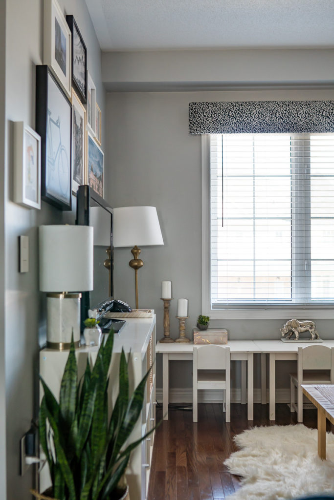
The kids playroom space wasn’t actually a space we planned to even tackle at the start of this challenge. If you go back to Week 1 when I shared my inspiration and mood board, that part of the room was NEVER included. But as I started setting up the living space, I just knew I had to change out the kids space too because they are essentially in the same space.
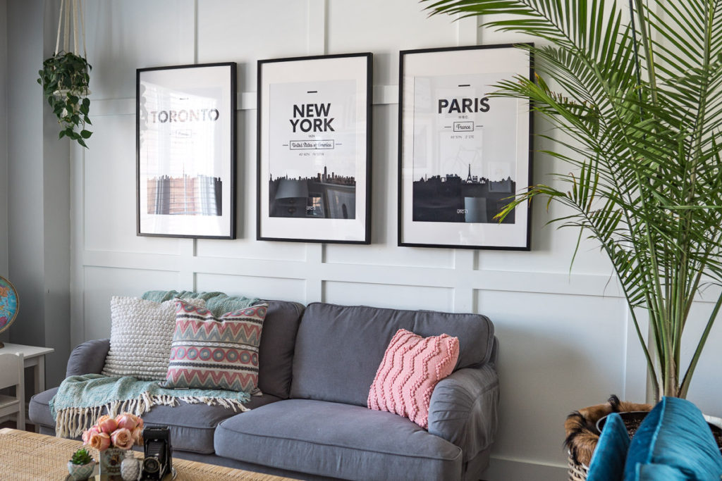
We turned to Ikea to really help us bring this space to life with a new couch, woven table (like honestly, how amazing is that table?!) and our gallery wall.
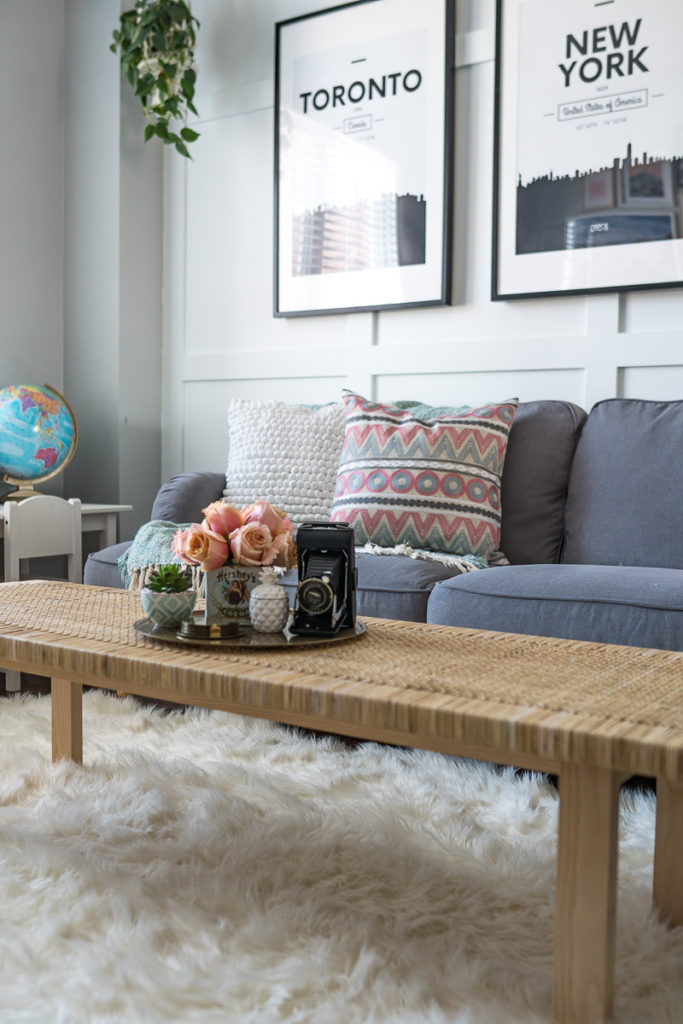

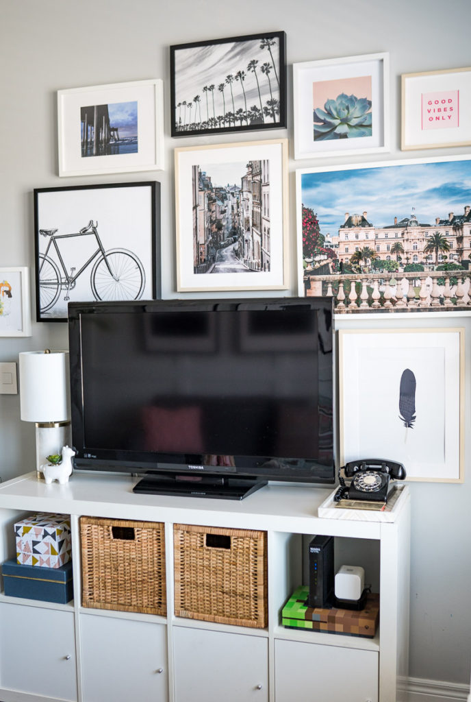
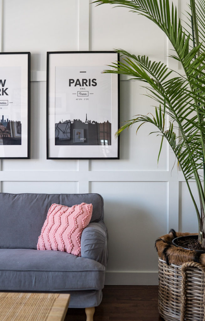
This gallery wall makes me smile every time I look at it. We printed our own pictures of our travels to Paris and California, which also inspired the larger cityscape prints behind the couch, which we got from Creative Market for only $12!
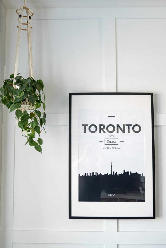
We also did a window treatment with a DIY’d valence, which I will do a full tutorial on soon! It was SO easy…Chris was actually the one who did it! Stay tuned for that!
We tied the space together with this fabulous faux fur rug from HomeSense, along with a few decor pieces from there as well. My sons favorite is the rhino on his desk!
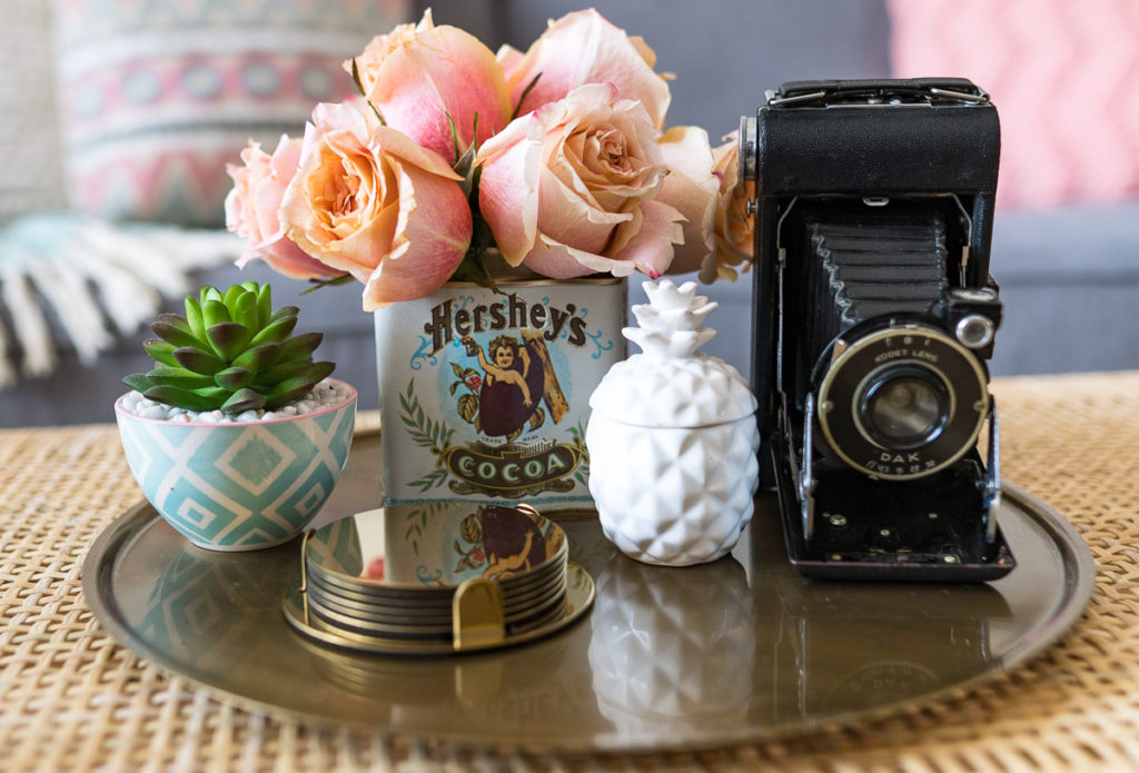
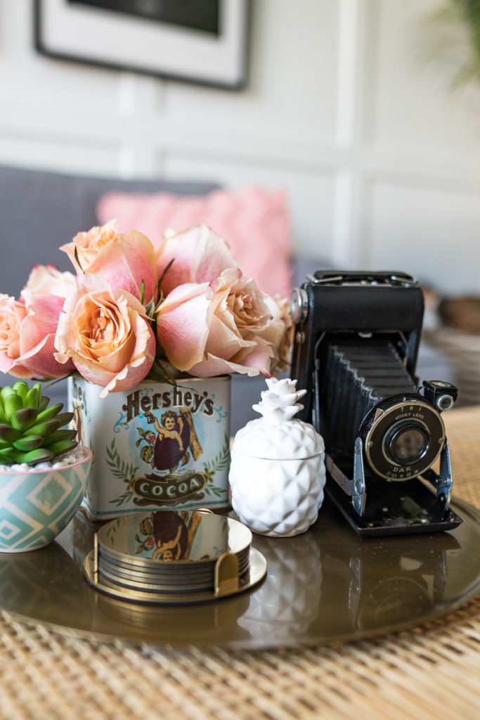
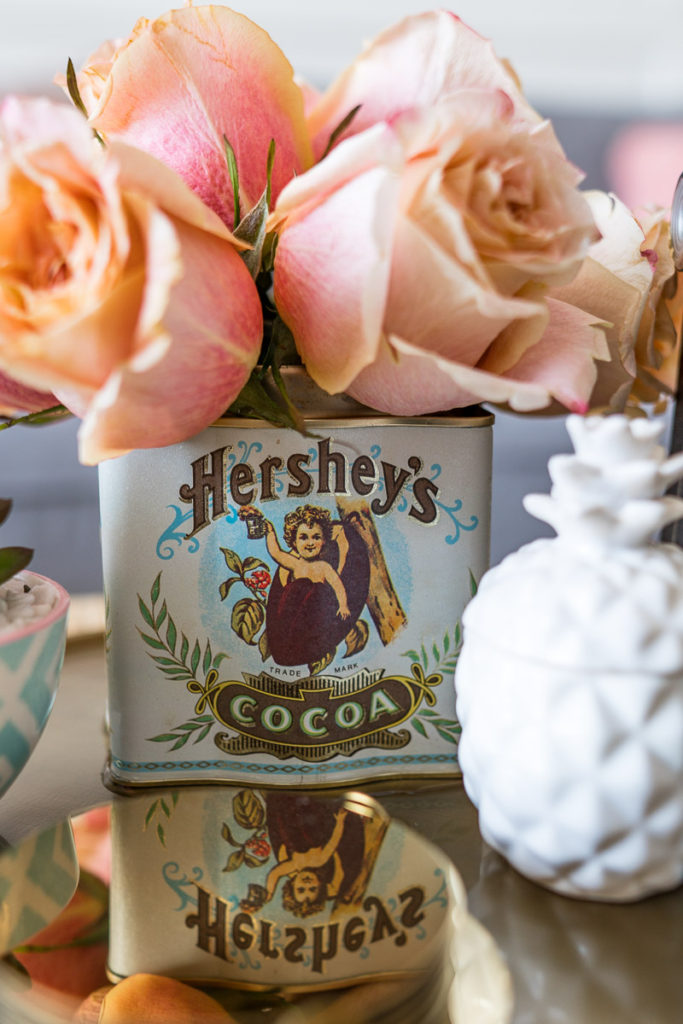
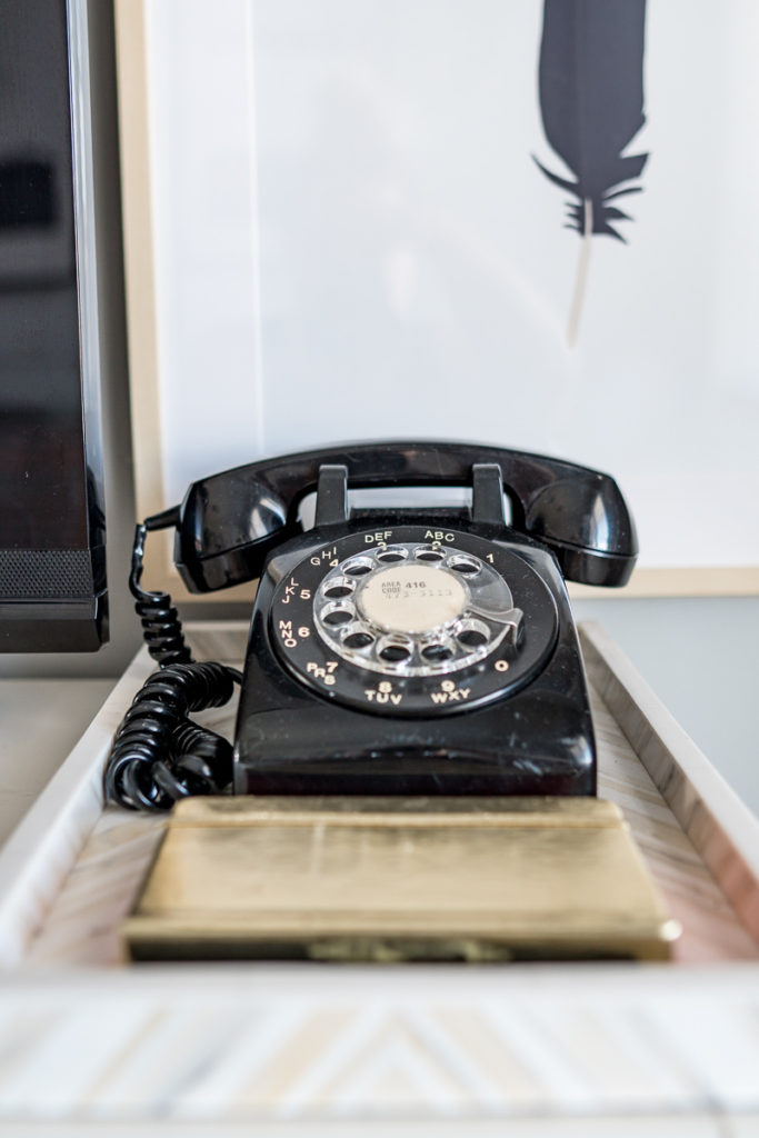
This was also a place where I added in a few antique pieces! I went to one of my favorite Antique stores called Redmans Barn in Port Perry, Ontario and found this amazing antique Kodak camera along with this Cocoa tin, which is the perfect vase! I also found an old, classic rotary phone that I just couldn’t resist! My kids think it’s the coolest toy! HA!
Well, there you have it folks! We are calling this our family living space and I’m SO happy that we have finally breathed LIFE back into it! We’ve already done family movie night in here twice since the makeover, which we weren’t doing that before because no one was comfortable on our old furniture. I find myself changing up spots throughout the day to work on the various couches and chairs to gain a new vantage point of the house!
If there’s anything I want to leave you with it’s this – don’t be afraid to take risks and step out of your comfort zone when it comes to decor. It was once I finally stepped outside what I was comfortable with that I ended up finding an even comfier place for me and my family to land. Have fun with colors and patterns and textures. Be quirky. Shop vintage. Mix old and new. Try new things and keep trying until you hit the nail on the head and create your perfect space!
I want to thank HomeSense for sponsoring this project! I have been a lifelong fan of that store for not only decor needs but even gifts, beauty products and speciality food items! There is so much to explore there with new items arriving every day…I try to go a least a few times a month to see what new gems are waiting for me to take them home!
I also want to thank Linda from Calling it Home for hosting this One Room Challenge and allowing us to be a part of it! I am always blown away by the community that rallies around during the ORC from both other design bloggers makeover their spaces to brands partnering with us to getting our spaces done to readers anxiously following along to see the transformation take place! It’s always such a fun ride and I’m ever so grateful that you’ve all joined with us this time again!
That’s all for this round friends! Until next November for the next ORC…
Love & Blessings,

