Welcome to week three of our Living Room makeover, which is part of the One Room Challenge!
If you’ve missed the last two weeks, make sure to catch up here with the inspiration for the room and here for the before pictures before you read on!
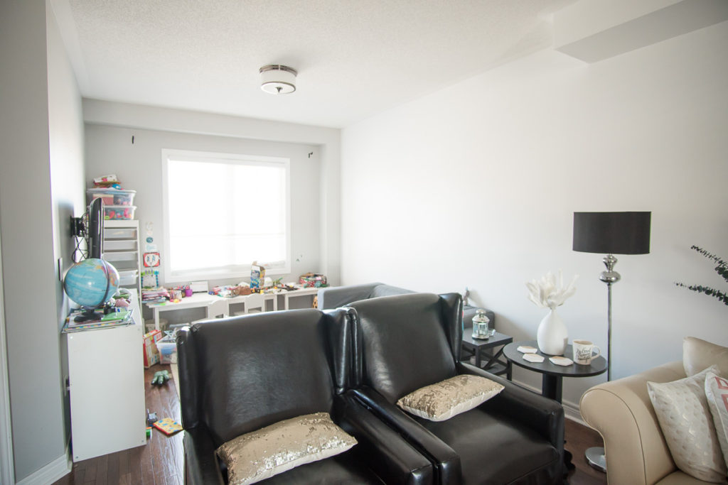
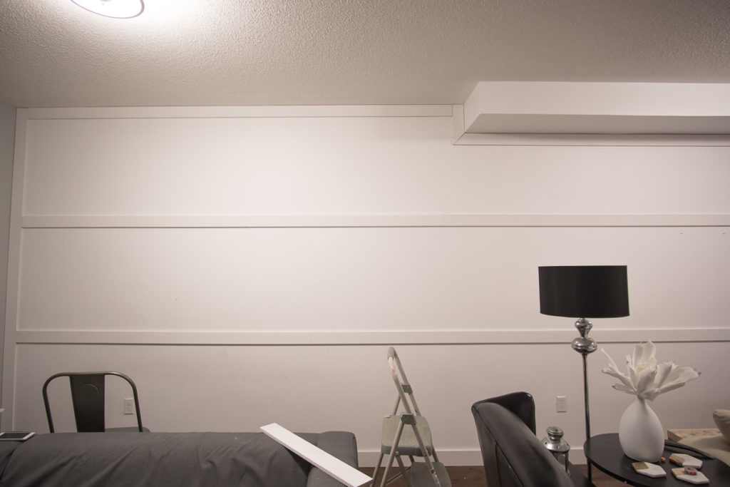
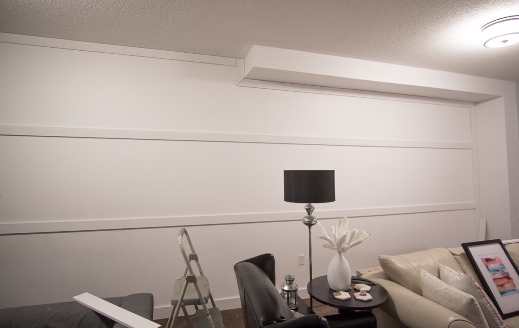
This week we are tackling the big wall! This will be the only “construction” that we do in the room as this house is still fairly new (only four years old). We are the original home owners and were able to pick out many of the finishes, including flooring, cabinets, etc. So most of the work that we have done in this home is really only surface level cosmetic construction (is that even a thing?!)
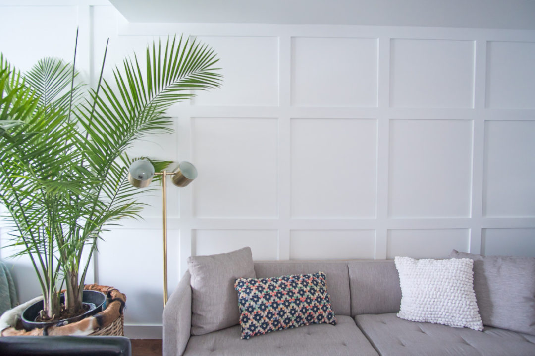
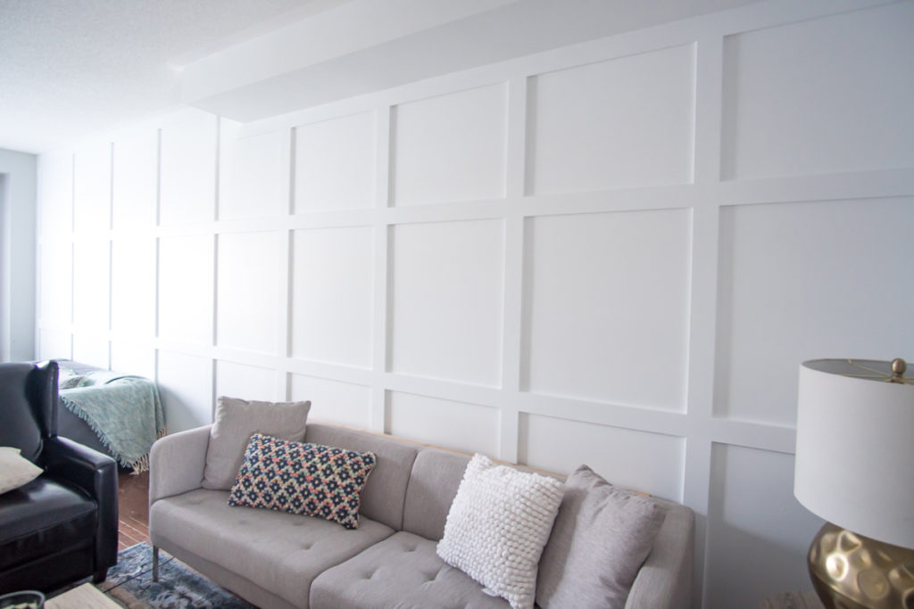
So let’s talk about this BIG wall. One of the challenges with a new home that I’ve found is that it can feel very “character-less”, unlike older homes, that seem to have built-in character with older architecture. And one place I’ve always felt it most was in THIS room, when looking at this massive wall. It was just so big and boring. So we knew we had to add in something architecturally pleasing to the eye and that’s exactly what we did.
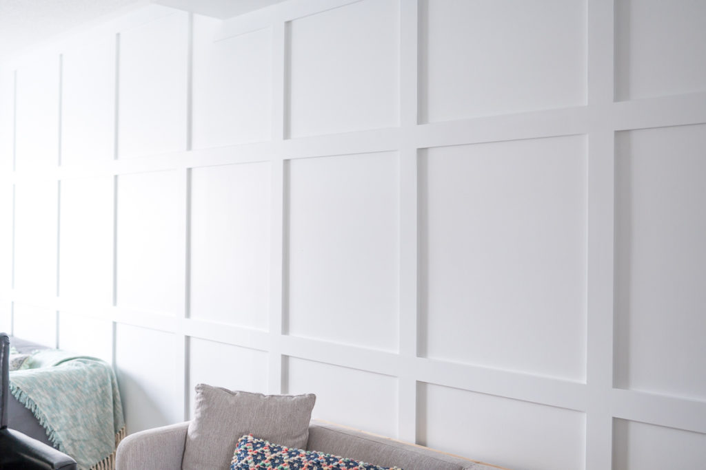
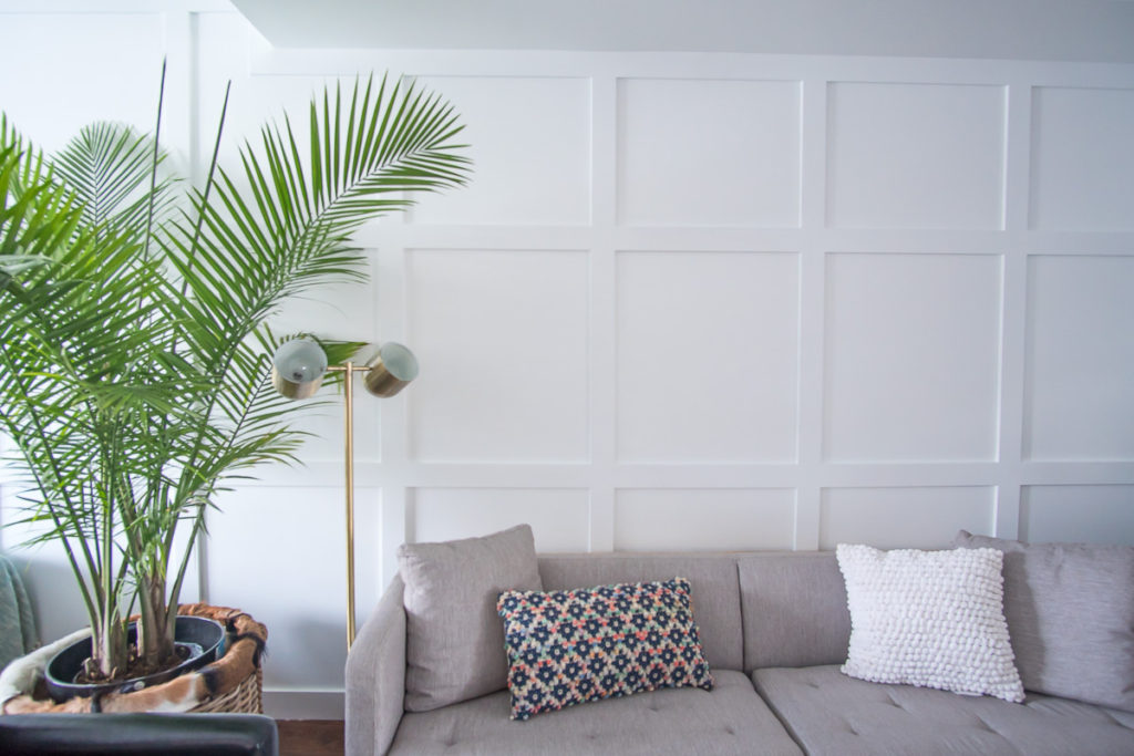
Similar to what we did in our master bedroom, we decided to do board and batten. The main difference though was that we were going to go up the entire wall and there would be no ledge. While I love the ledge in our bedroom as it acts as a nice place to perch pictures and breaks up the space, allowing for two different paint colors, I think that deciding to go all the way up the wall in the living room, with one solid paint color, dramatically made the room feel so much grander, while adding a layer of depth and character.
Adding board and batten to a wall is such an inexpensive feature to add to any space that has maximum impact. Here’s how we did it.
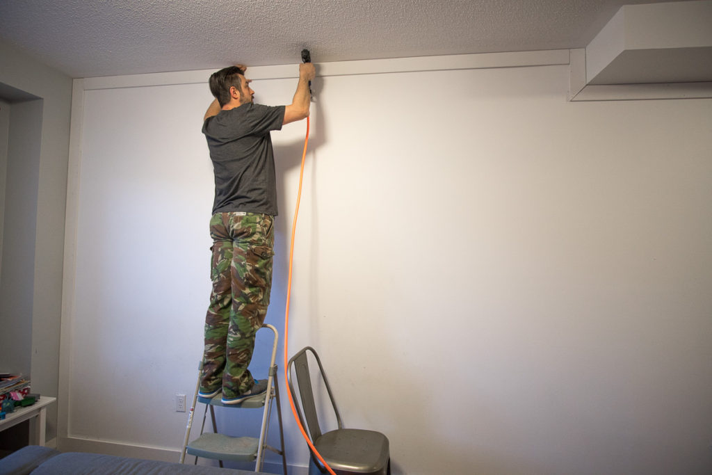
To create the board and batten we took a very simple approach. We used 12 foot lengths of 4 inch wide moulding. Chris first applied the horizontal boards starting with the top and bottom. Then the middle two horizontal boards.
After that, he installed the vertical battens. This part was both slightly confusing and funny at the same time. It was definite teamwork to get it to look exactly how I wanted it to. I knew roughly the size of squares that I wanted, so after we measured the wall, I divided the size of squares into the wall length. We came up with nine battens, which included the two ends. The very last square on the inside corner of the wall is slightly smaller than the rest because we weren’t about to get THAT intricate with our measurements to split the difference between all squares (does that make sense?!).
The part that took the most time was the finishing. Where the boards and battens met the wall, Chris used a white acrylic latex caulk to fill all the cracks. If there were any flaws in the joints between the boards and battens, he used drywall compound to smooth things out. Because the wall wasn’t totally flat, there were a number of joints that needed to be treated. He liberally applied the drywall compound until the joint looked even. Once the compound was dry, he sanded everything until it was smooth. After everything was painted, all the boards and battens looked like a single, seamless piece.
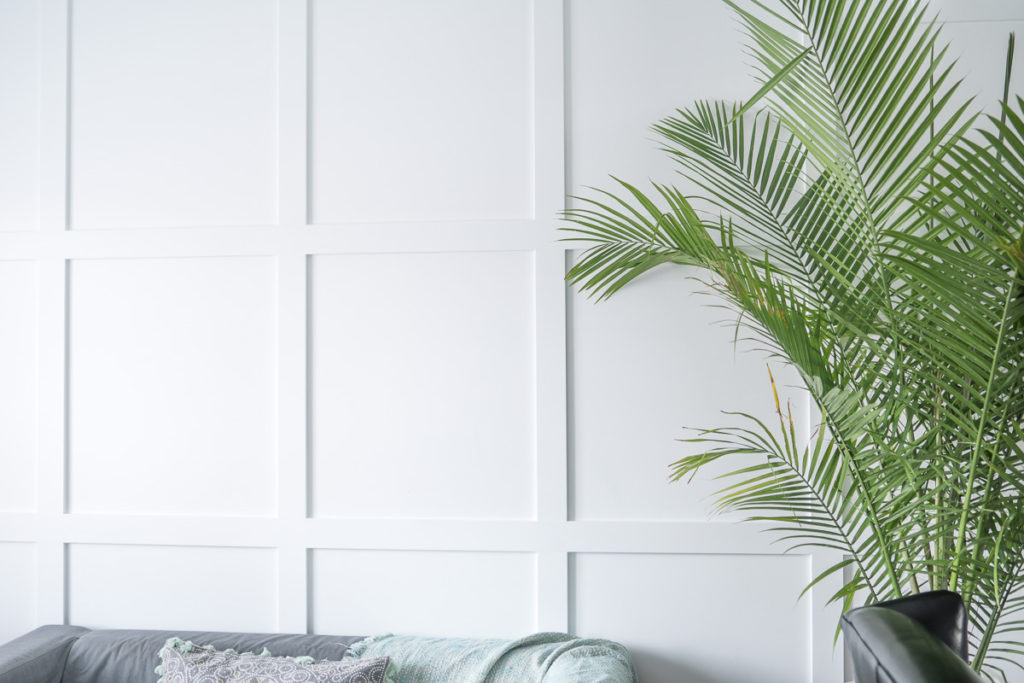
Now let’s talk about the color. I will admit that this wall has changed color a few times since we’ve lived here. The first time we painted it, we went with a darker grey. I originally liked it, but overtime I felt like it was too dark for the space. Because we only have a north facing window in the space, it doesn’t get a ton of natural sunlight, especially in the inside corner of the room. We then painted it white and left it for a couple years.
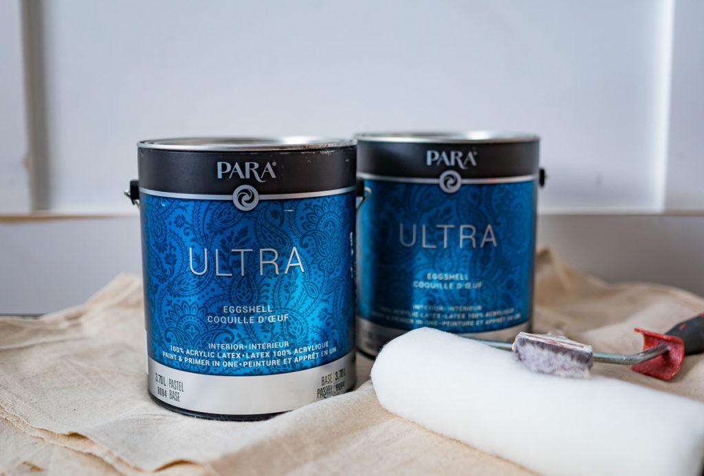
We knew that we would need to repaint now that added the board and batten, so this time we were very careful to choose the perfect shade of white. For this, we turned to Para Paints. They have a whole new color system called Color Journeys and we went with Cloud White.
Some people might think any white will do, but after painting many of our rooms white in this house, I can tell you that no two whites are the same and it’s really important to choose correctly.
For this space, we already had a grey color on the walls that has a brown undertone. Furthermore, most of the furniture we have selected for the space has warmer tones to it. So when trying to find the perfect white, it had to be a soft white, not a cool white (unlike our kitchen which is a much cooler white).
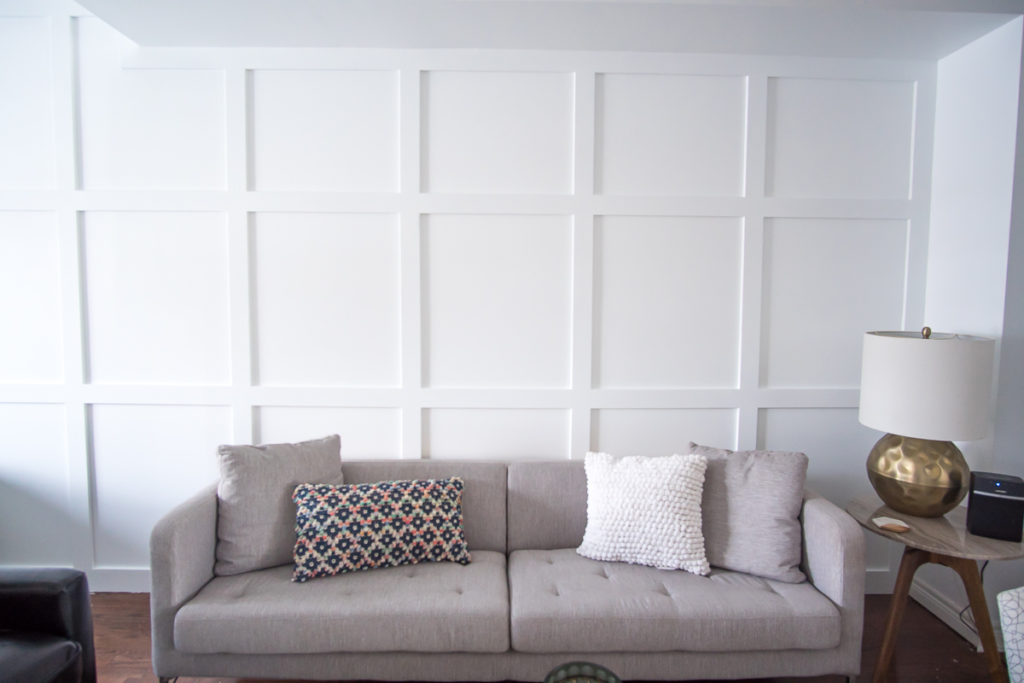
We found an old swatch of the grey color on the other walls, along with gathering up a few pillows from the space and put it against a number of different whites from the Para collection. Cloud White was the definite winner. Still a pure white, it has a softness to it that brings a nice, warm touch to the space.
What I also loved was the quality of paint we used. It was our first time trying the Ultra paint from Para Paints and I was really impressed. It acts as both a primer and paint in one and because we are mostly painting over white, one coat was more than enough. It also had very low odors, which is always something I value when doing indoor paint in the winter time!
Here’s a little sneak peak of what’s to come in the following weeks! We are still playing around with the furniture and decor, trying to make this space both functional and beautiful for our family!
Stay tuned!

Love & Blessings,

Note: This post was sponsored by Para Paints. All thought and opinions are my own.