Welcome back to week two of the living room makeover one room challenge!
In case you missed week one, make sure to check out my inspiration for the room here.
As promised, this week I’m showing you the dreaded “before” shots of our living room space. I had mentioned last week that it’s such odd space and now that you see the pictures, I’m sure you can understand what I mean.
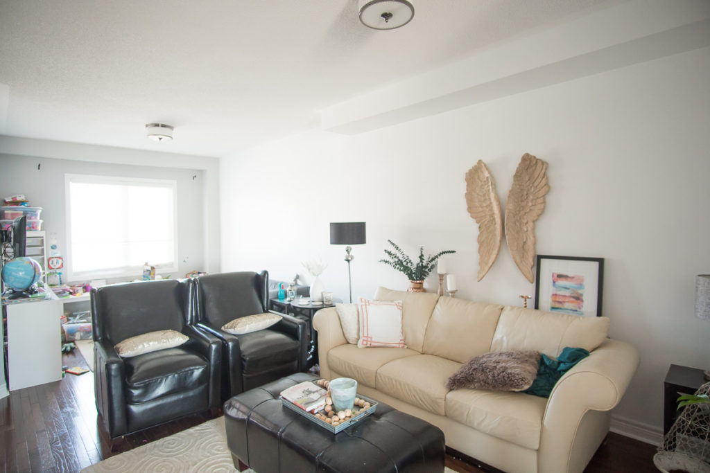
For starters, this is a double-use room. As you can see from the set-up, we have the kids playroom tucked on the window side and then the living space on the other side. But this space is even weirder because it also serves as a hallway, connecting two flights of stairs, and an offshoot to my office on the other side of the playroom wall and the kitchen. I feel as though it’s the crossways of our home and because of that, it needs to be functional. But as you can see, with only one, extremely long wall to ground the space, it gets complicated quickly!
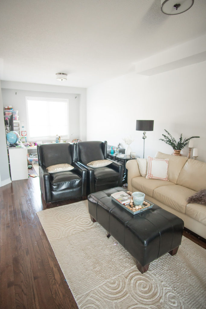
Over the last four years that we’ve lived here, I’ve changed up the space probably six times. I looked back to see if I had documented all of them and could really only find this set up from our Spring Home tour last year. I had actually just re-arranged it and thought it was the best layout at the time. I was SO stuck on having that fireplace in the room and with only that one wall that it could fit against, it really limited how we could set up the space.
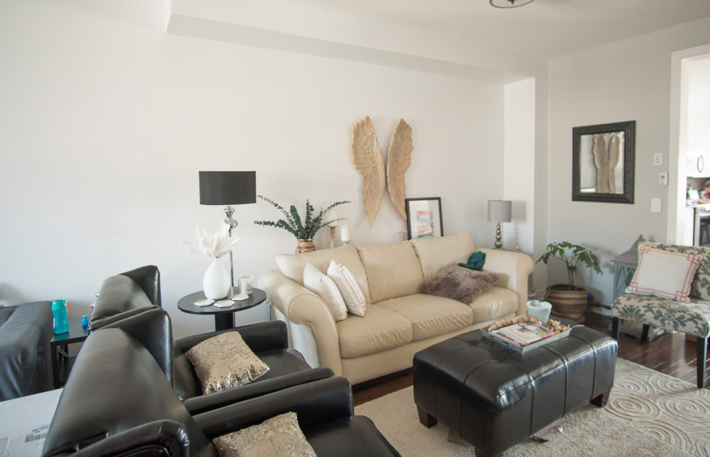
It wasn’t until this Christmas that I was struggling with where to put our new Christmas tree that I finally decided to move the fireplace downstairs and tried putting the couch against the wall. You can catch a glimpse of that here. I can remember when my kids came down the next morning they all said “WOW! Can we keep it like this forever?!” Funny how even young kids can pick up on functional design, eh?! Needless to say, the couch against the wall, more open concept has stuck around and will be part of the newly decorated space!
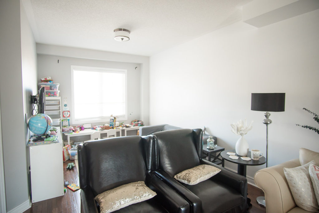
But as I’ve been moving things around for four years constantly with this space, you can tell by these pictures that there’s just never been a real design concept in this space whatsoever. All of that furniture was bought about eight years ago, for a different house and we just have never been able to make it work in this space.
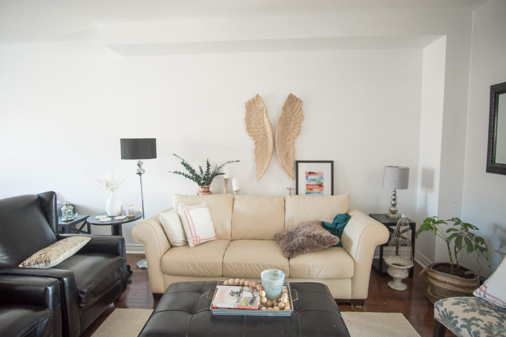
Also, having the kids play area out in the open like that has been honestly quite stressful. It’s constantly messy and it’s been tough to figure out how to make it work for them but also still be beautiful for us. While I wasn’t planning on featuring that space during this one room challenge, as I’ve been working away at the room, it has naturally just become a part of the process and I’m already loving the simple changes we’ve made in the space!
So that’s it for this week! Make sure to come back next week as I begin to show you the simple and incredibly affordable DIY that we did which transformed that massive wall, giving it depth and actually making the space feel even bigger, yet cozier than before!


