Welcome to our daughter’s room makeover!
This is so exciting for us to share with you and we hope that you LOVE it just as much as we do!
As I said in the before post, this wasn’t something we had planned out for months, it was more impromptu after we chatted with a few of our amazing sponsors HomeSense and Canadian Tire Premier Paint.
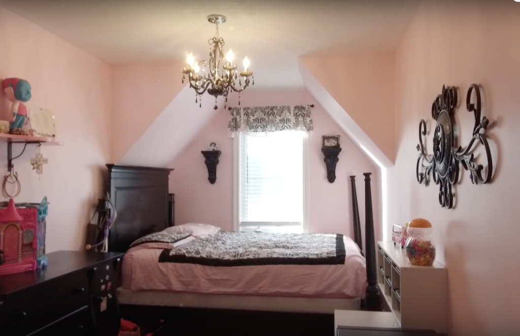
Before we reveal the big REVEAL, we HAVE to look at what we started with. Brace yourselves…here is what her room looked like BEFORE we got started.
And here is the AFTER!!!
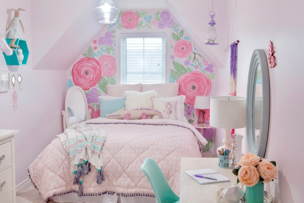
My daughter had long been saying that she didn’t like her room anymore…that it wasn’t her style and simply wasn’t working out for her.
She had two requests for the design: there had to be purple in it and it had to remain kid-friendly. If she truly had it her way, we would have seen her vision of “calm pop star” come to life complete with purple cheetah prints on the wall! No joke!
But with some guidance from myself and a TON of inspiration while shopping at HomeSense, we came up with this design together!
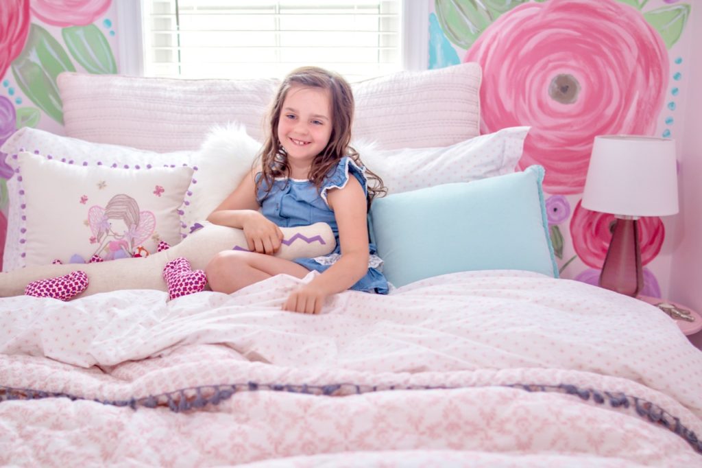
We decided on a very light pink, which was actually listed as part of the white family from the Canadian Tire Premiere Paint collection, called Soft Lace. I didn’t want completely white walls, making it perhaps too light and sophisticated for the space. So with this soft pink, it still has a sense of “girl” to it while still bringing a level of chic to the space.
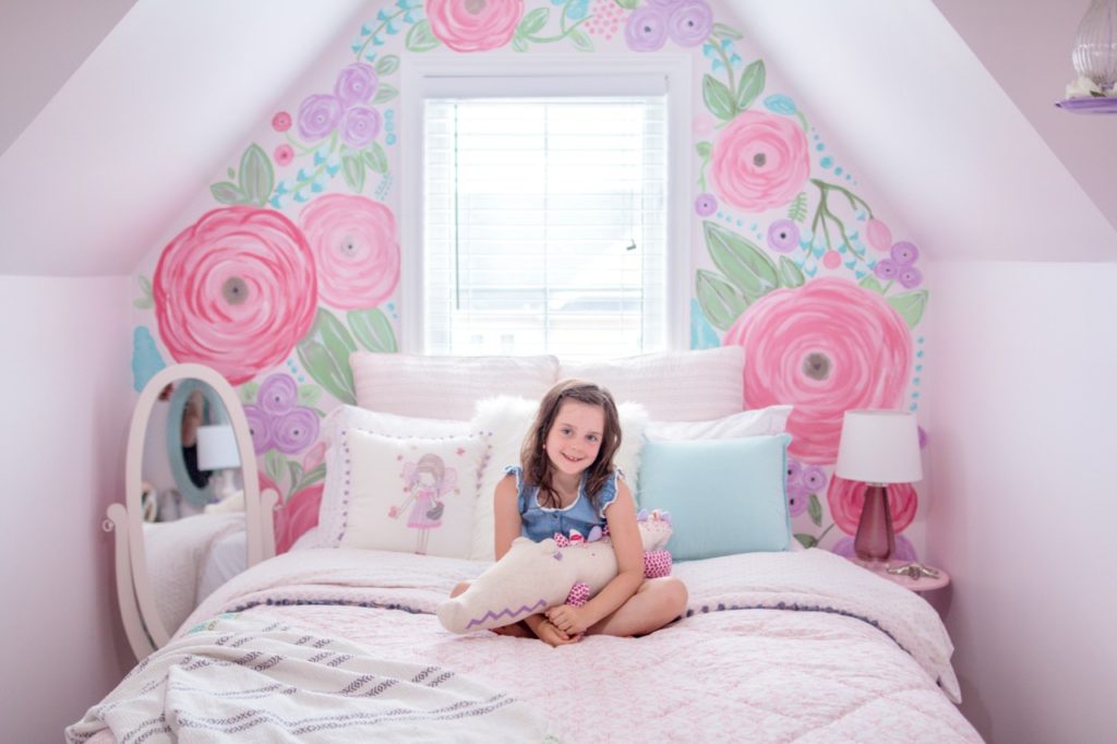
We decided to keep the queen size bed because we have lots of visitors that come through and don’t have a dedicated guest bedroom, so her room often doubles as that. So the queen had to stay, but we had to make it work better than how it was stuffed into that little alcove.
So we turned the bed so that it would be right under the window, leaving room on both sides to walk. Because it was now under the window, that meant that there couldn’t be a headboard and that the wall would have to double as such.
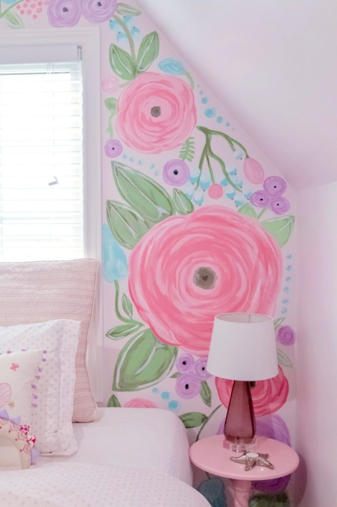
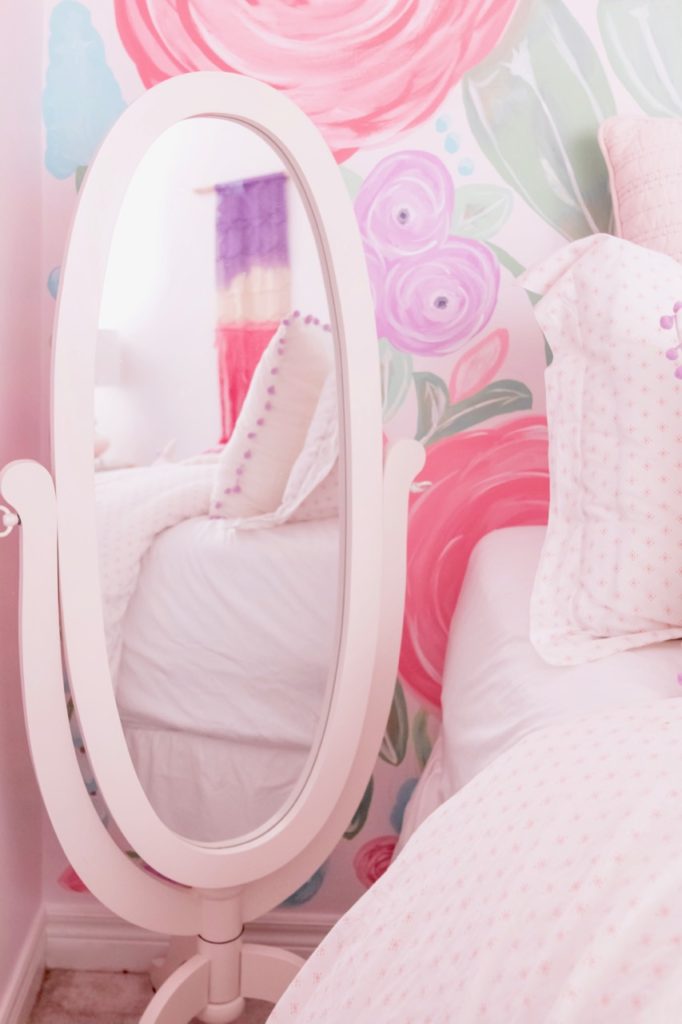
I had always wanted to do a floral wall (in fact, eight years ago we did wallpaper our powder room in our first home with an oversized floral print. I’ve never blogged about that space, but perhaps one day I will! It was beautiful). So I considered various wall papers or even decals. But after seeing a few other spaces online that had hand-painted a floral wall, I thought, “Let’s give it a try!”
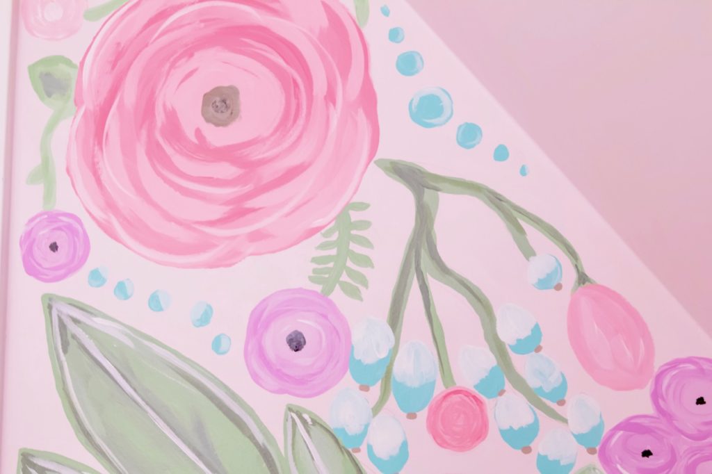
So I created a Pinboard for all kinds of floral pattern inspiration, purchased a floral designers package from Creative Market and then free-handed the design onto the wall. Because the space is rather small, I didn’t care for a repeating pattern, rather just have a random floral mural.
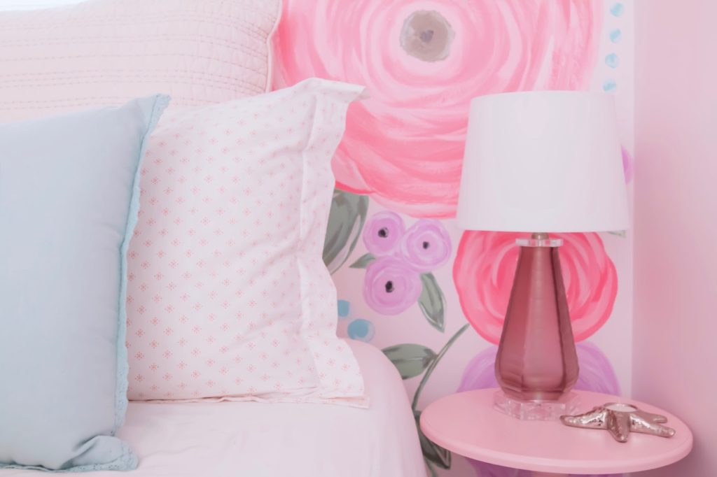
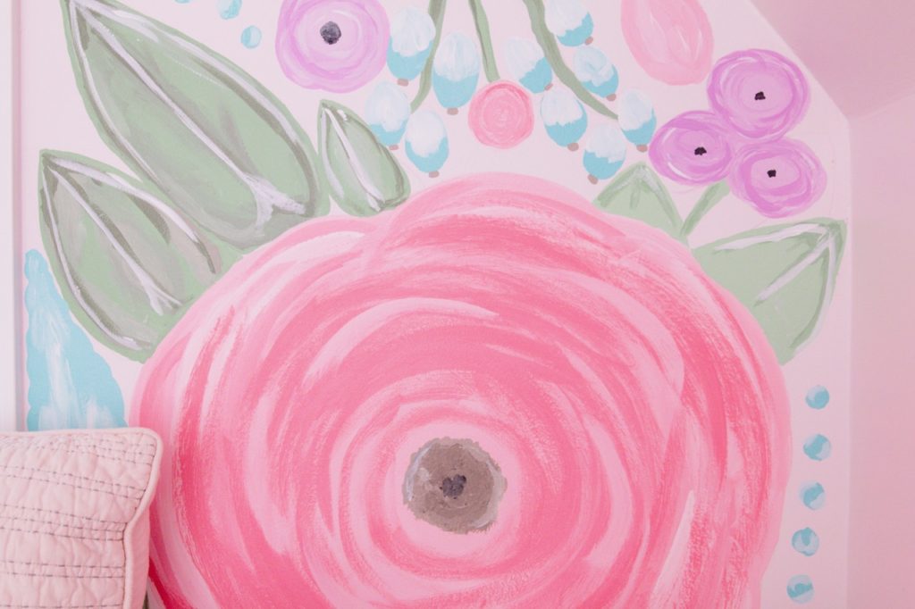
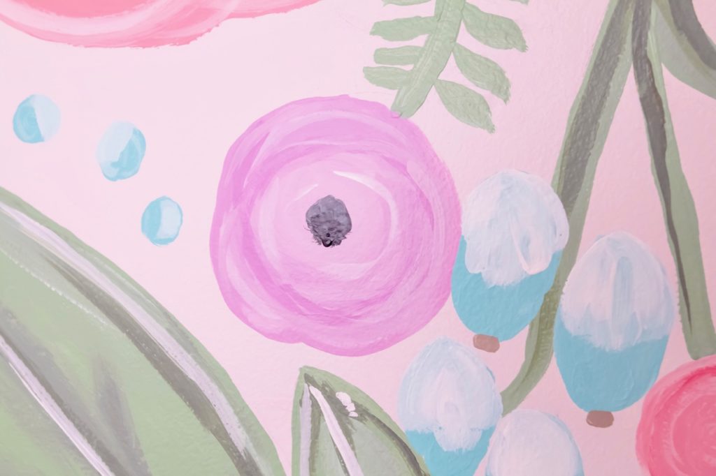
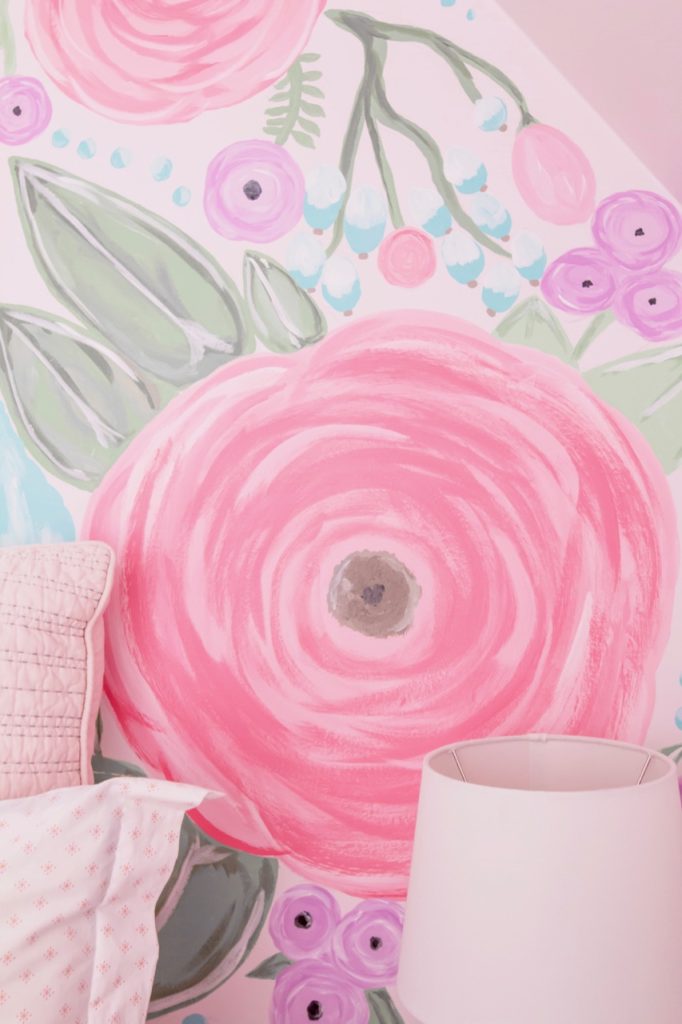
Then using a wide assortment of Canadian Tire Premier Paints, we started painting! It was a very therapeutic process for me where I realized I actually really enjoy painting much more than I thought I did! Because there was no pattern, there was really no rules. So even as I was painting, if I would decide to change the design that I had lightly traced, I would just go with the flow.
In the end, I love the way the floral wall turned out. As a “Type A” personality, doing something like this is VERY outside of my “comfort” zone. If I stare at the wall too long, I can start to notice the imperfections and think maybe I should change it. But that was the whole point of the design…to feel natural and organic and a little bit imperfect!
Now let’s talk decor!
Like I said above, we had a general idea of the design: we knew soft purple and teal and it had to remain somewhat kid-friendly (so I knew that meant incorporating some characters or animals). As you can see from the pinboard, I wanted a somewhat whimsical, bohemian feel to the room while still remaining modern.
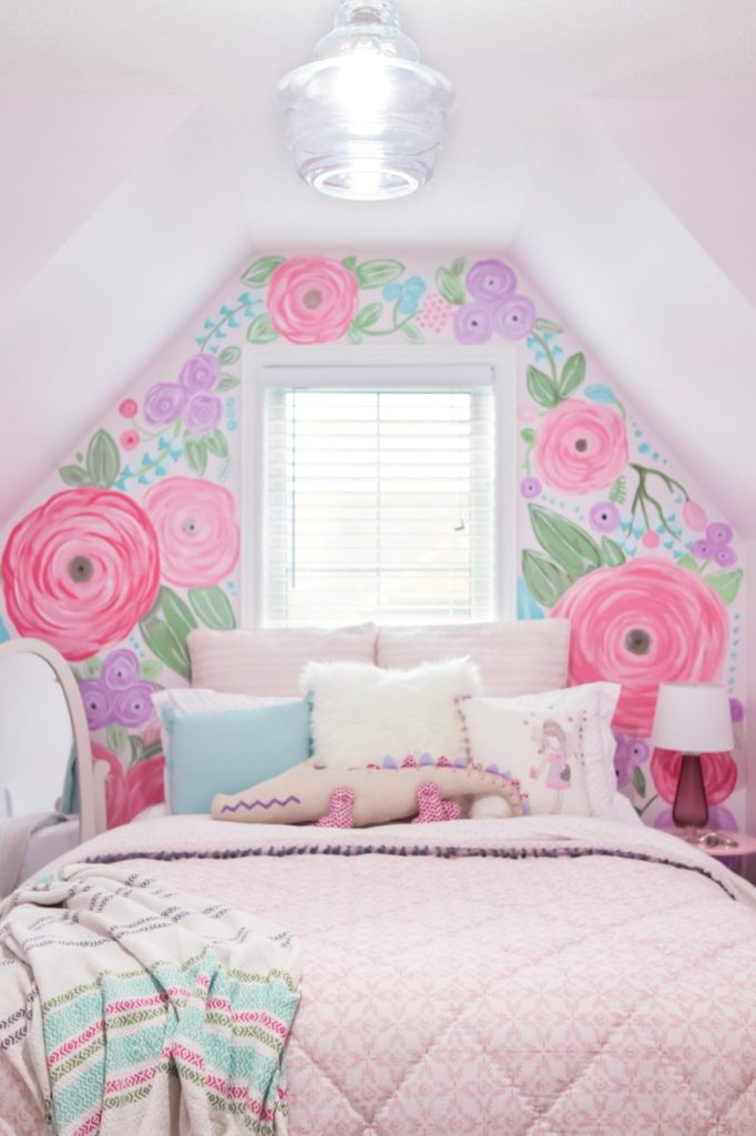
So when I went shopping at HomeSense, I really just let that inspiration guide me. Their newly improved kids section blew my mind! I absolutely LOVED all the options and quite honestly had a hard time narrowing down my choices.
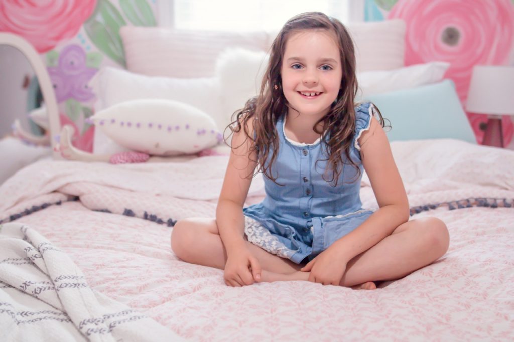
The bedding was fun to piece together. One of the things that I learned from the last time I did my daughter’s room was to not get a 5-piece bedding from a bag, but rather add in different layers and patterns to really build a beautiful design. So we layered in a duvet and a comforter (her room gets really cold in the winter, so she always sleeps with two layers) of this similar floral diamond pattern with almost an arabesque feel to it, in a soft peachy pink color. I layered in this beautiful tasseled throw blanket that just finishes off the look perfectly!
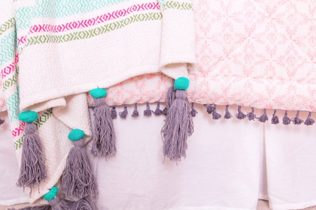
We also layered up a bunch of different pillows, because who doesn’t love a ridiculous amount of pillows on their bed, right?! I loved adding in varying sizes, colors and textures, including the white fluffy pillow front and center. And of course, in keeping in that “kid” vein, we HAD to bring in our new friend Allie the alligator to finish off the look!
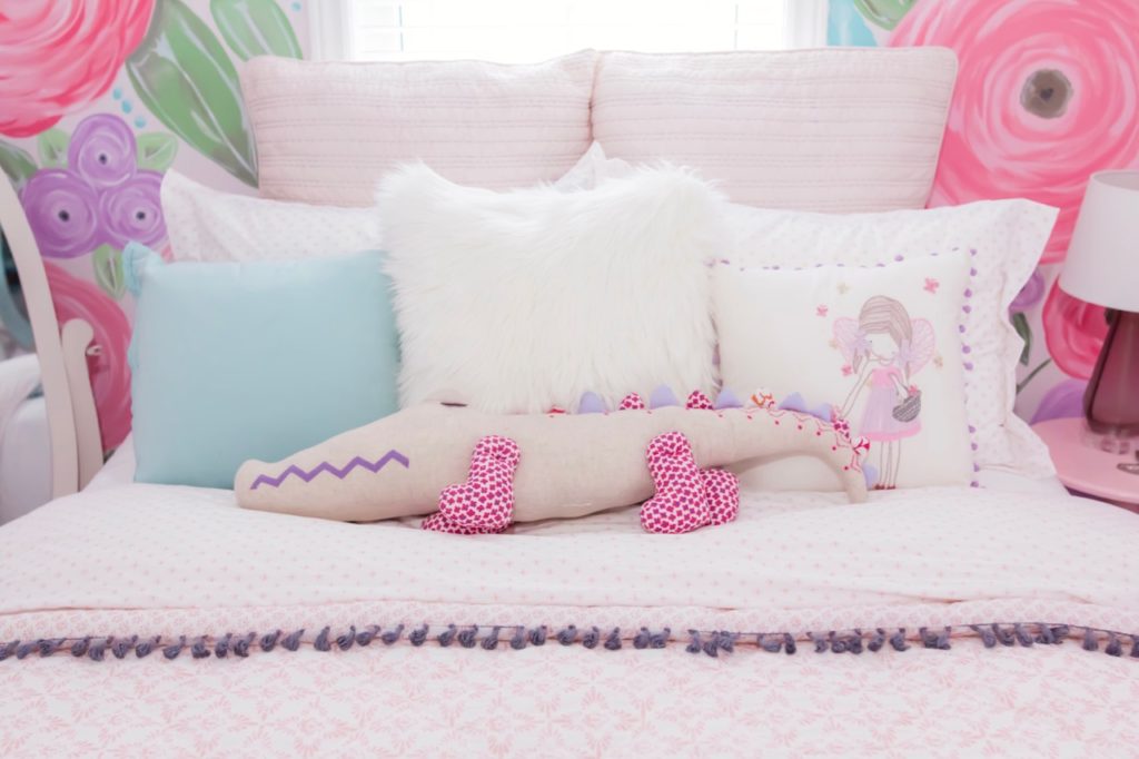
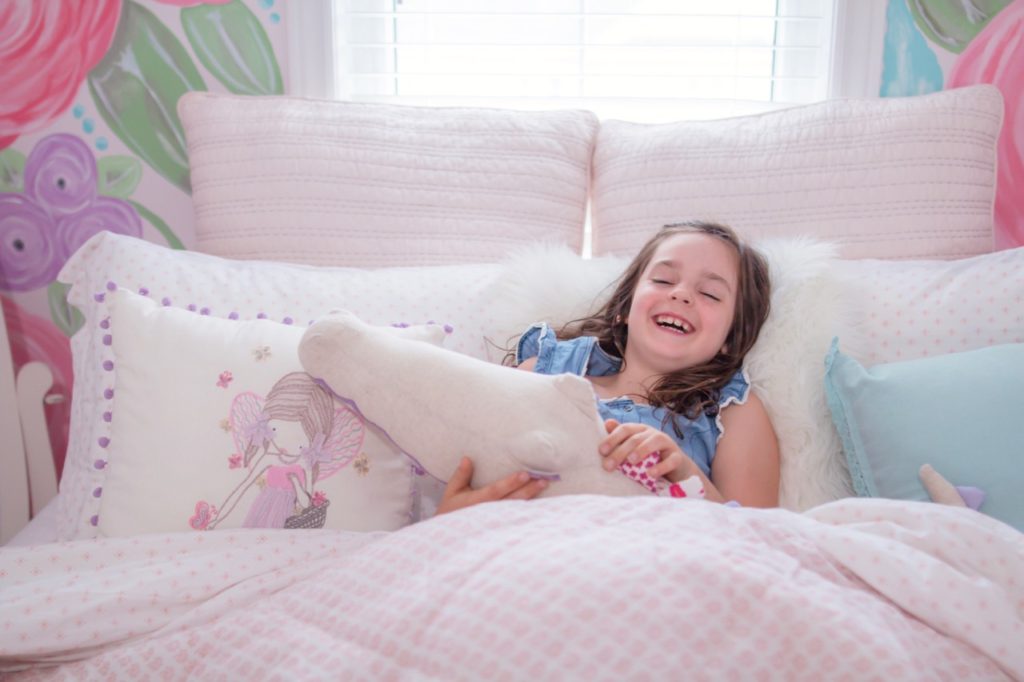
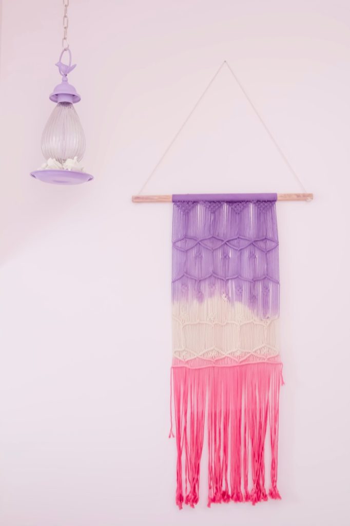
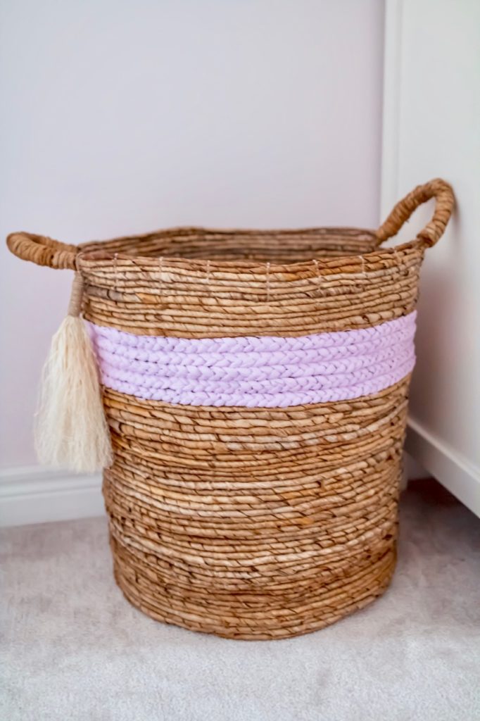
To add in that bohemian vibe, I wanted lots of textures. From the pompoms and tassels on the textiles to the macrame wall hanging and the woven laundry basket, adding in some of those varying textures really gives the room a natural, more lived in feeling.
Even with the desk, when I found this white-washed wood grain finish desk at HomeSense, I knew it would fit perfectly in the space and help bring in that more earthy, boho vibe I was going for. Pairing it with this ultra modern, mint green chair was the perfect match to marry the different designs in the space.
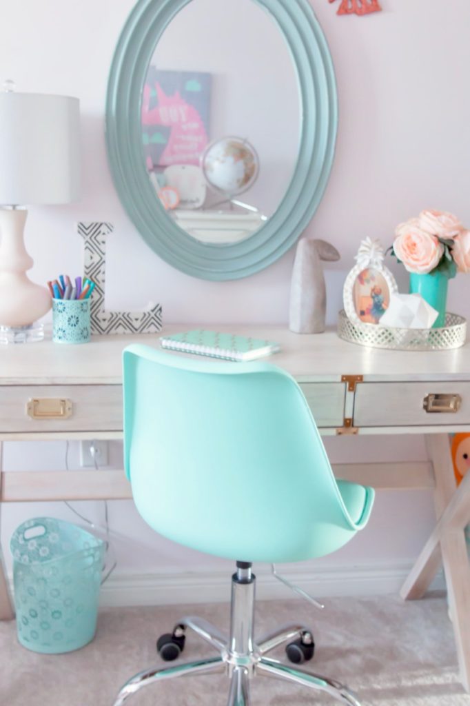
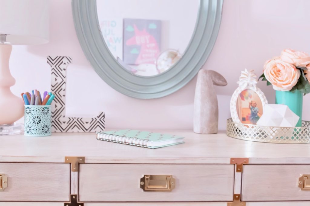
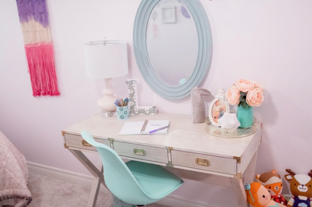
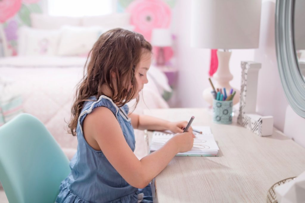
When it came to styling the desk and dresser, I really wanted to mix up items that still felt “kid-friendly” but also looked chic enough for the space. So pairing a gold trays with faux flowers but adding in cement rabbit sculptures, a globe and unicorns all worked well to achieve that look. We also had a few personal items, like the picture of the four generations of women in my family, that meant a lot to my daughter, especially since my Grandma recently passed away. So it was important to incorporate some of those more sentimental items as well.
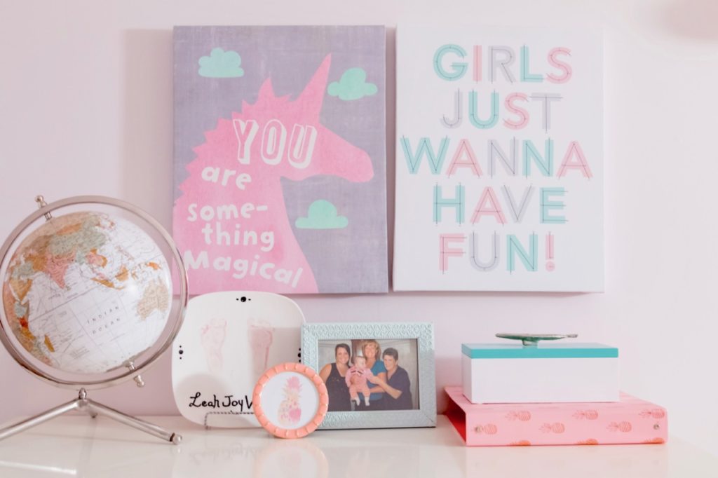
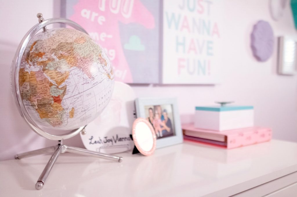
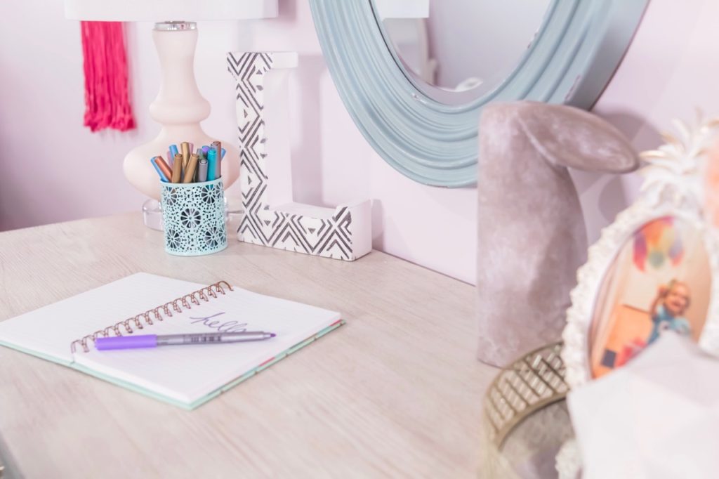
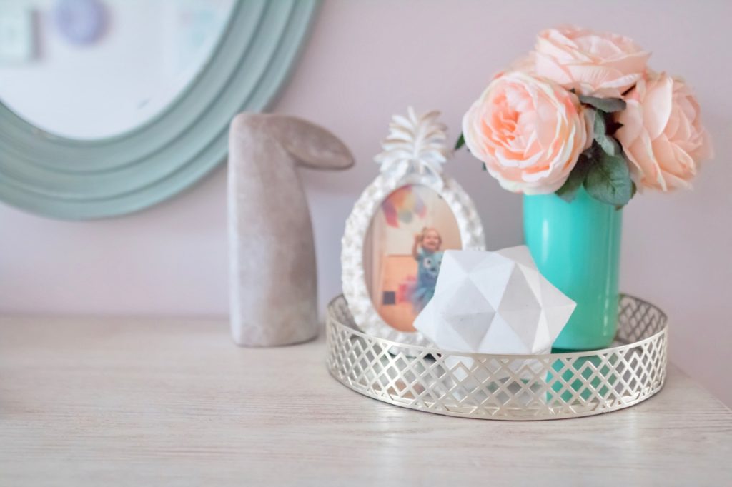

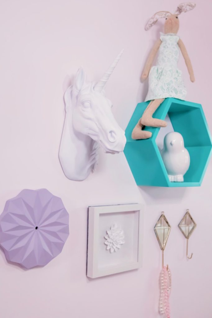
We can’t forget the side walls! We created a little gallery section with this beloved unicorn friend that was sent to us straight from HomeSense headquarters! My daughter was THRILLED when it arrived! We also incorporated some more unique pieces, like the lavender medallion, which is actually a clock that was broken in the clearance section. But I LOVED the shape and color and knew I could pop the broken clock mechanics out and use it as a beautiful piece of art.
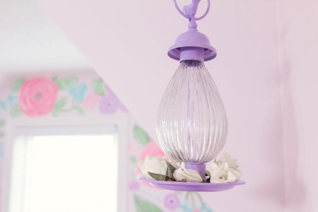
Also don’t be afraid to shop in the different sections of a store for inspiration and unique finds. Take this bird feeder: it was in the seasonal section and is definitely mean to be outdoors. But I loved that the color matched perfectly and thought it would add a nice flair of whimsical to the room. I added in some faux roses instead of bird feed and found the perfect home for it hanging in front of the alcove!
One of the things I’ve learned over the last few years of exploring different designs is to not be afraid to mix textures, patterns and design styles. While there are certain rules in design, rules are definitely made to be broken. A HUGE source of inspiration for me has come from watching Mr. Kate on youtube. If you aren’t familiar with her designs, go check her out…I promise you will leave feeling super inspired and challenged by her amazing designs!
 Well there you have it my friends! Our daughter’s room makeover! Check out the video below to see the entire room and hear more about my inspiration and design choices!
Note: This room makeover was sponsored by HomeSense and Canadian Tire Premier Paint where I may have received product and/or compensation in exchange for my honest review. As always, all thoughts and opinions are 100% my own. Thank you for continuing to support the brands that make Amidst the Chaos possible!


